

ESTHER’S TABLE KITCHEN & COCKTAILS
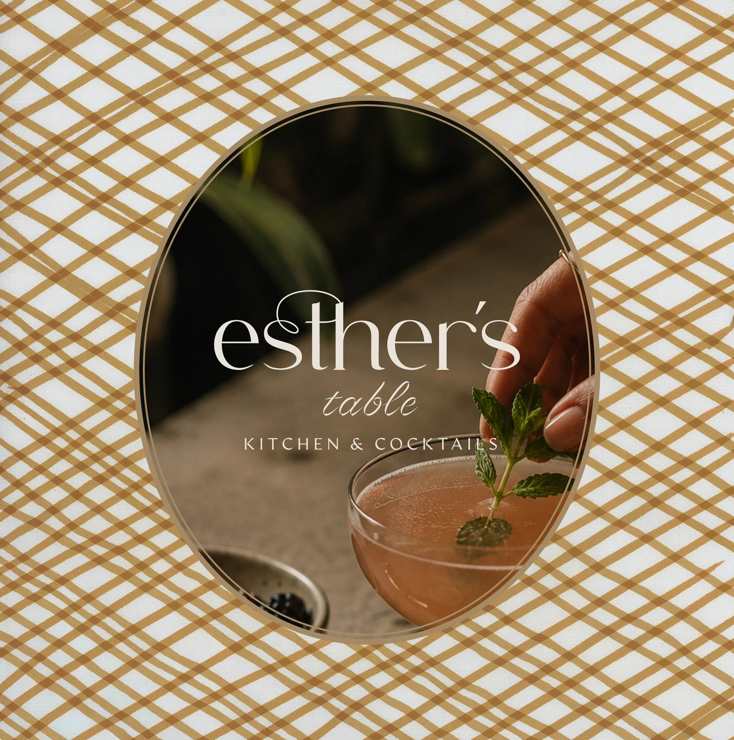
Named after Esther Capp, a local Minneapolis icon whose family has helped reshape the fabric of the city since the 1960s, Esther’s Table draws on her colorful life, unconventional spirit, and generous approach to hospitality. Second Wave created a distinctive restaurant brand that feels personal, playful, and full of character. A place where the good dishes are meant to be used, strangers become friends, and a little rule-bending is highly encouraged.

OUR SERVICES
BRAND ARCHITECTURE
Brand Story / Concept / Personality / Voice / Soundbites
VISUAL IDENTITY
Brand Story / Brand Concept / Brand Pillars / Activations / Brand Personality / Brand Voice / Copywriting
VISUAL IDENTITY
Design Aesthetic / Logo Suite / Collateral Design + Development / Packaging / Merch
THE CHALLENGE
A Life’s worth of stories
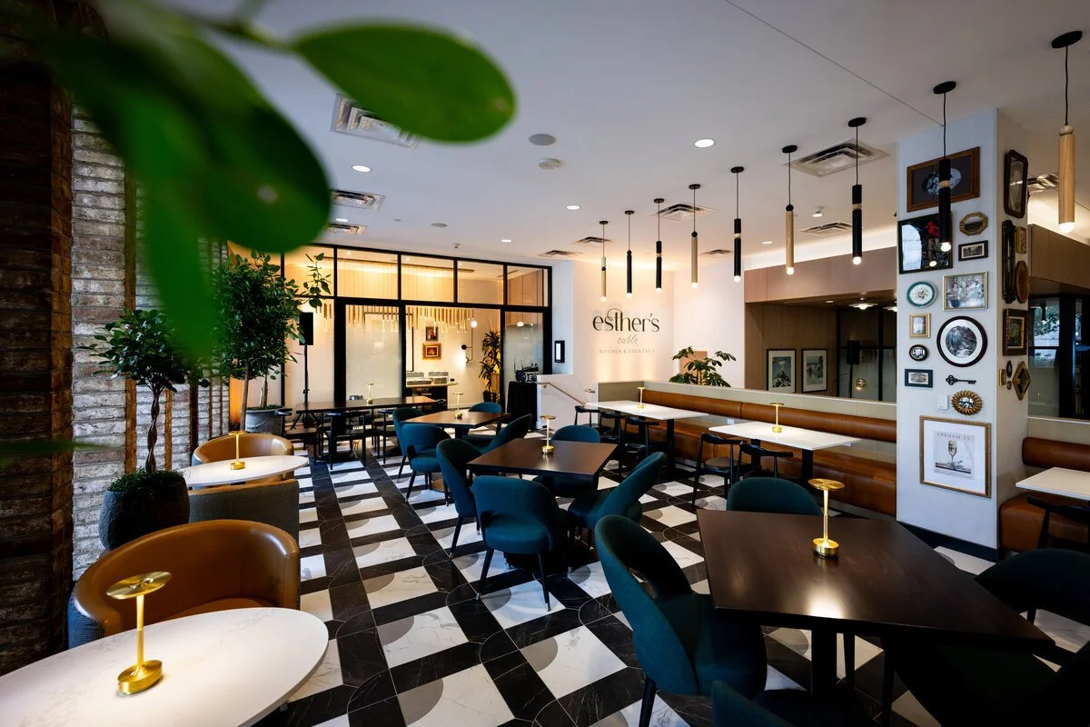
How do you infuse an all-day dining restaurant within the Sheraton Minneapolis with the vibrant energy and eclectic style of a woman who was larger than life? How do you pay proper tribute to a local legend?
As Esther's Table prepared for its next chapter and an interior design overhaul, the opportunity was to create a more distinctive identity that complements the restaurant's refreshed interiors while building a stronger emotional connection with guests. The challenge was to honor the legacy of Esther Capp without simply looking to the past. Her remarkable personality and colorful life offered a wealth of inspiration, but translating those stories into a cohesive, contemporary restaurant brand required finding the right balance between nostalgia and relevance, sophistication and playfulness, and personal history and universal appeal.

THE CONCEPT
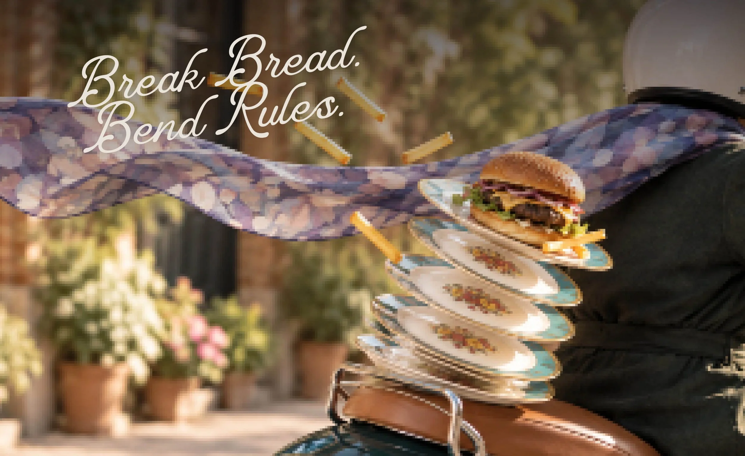
BREAK BREAD. BEND RULES.
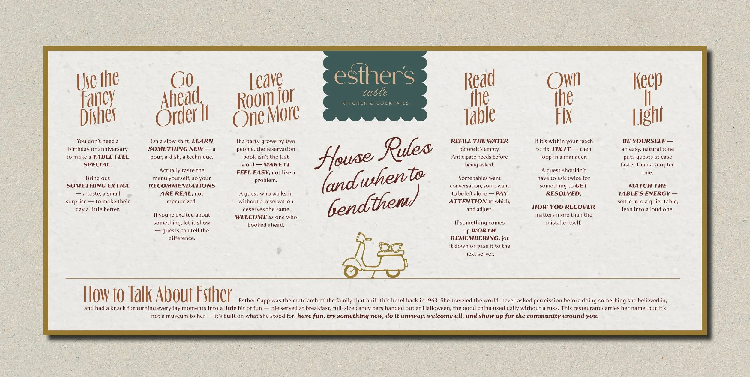
The restaurant may carry Esther Capp’s name, but it’s not a museum to her…it’s built on what she stood for: have fun, try something new, do it anyway, welcome all, and show up for the community around you.
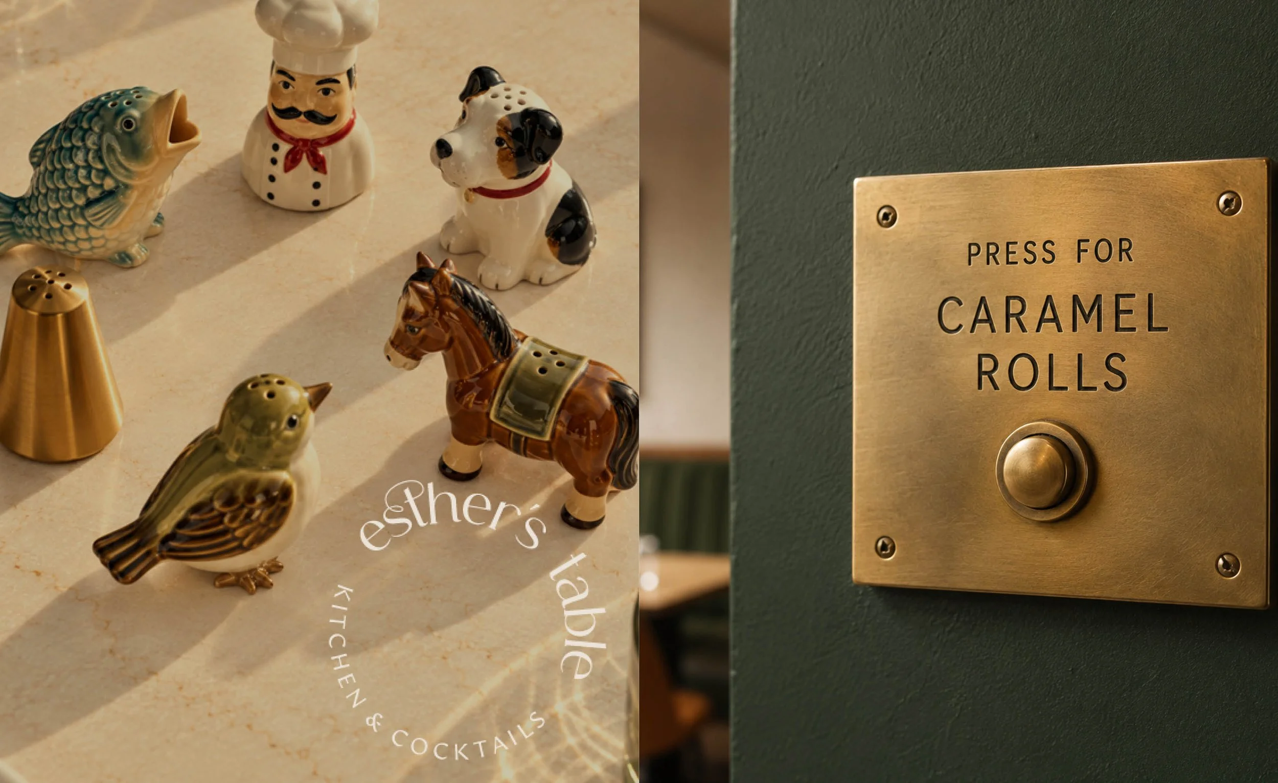
These simple philosophies became the foundation for a brand built around curiosity, generosity, and the belief that life is an adventure worth sharing. Rather than simply celebrating who Esther was, the concept brings her spirit to life through the restaurant experience. From a welcoming, conversational brand voice to playful storytelling and unexpected details, every element encourages guests to embrace something new, enjoy the moment, and make themselves at home.
VISUAL LANGUAGE
BEAUTIFULLY UNCONVENTIONAL
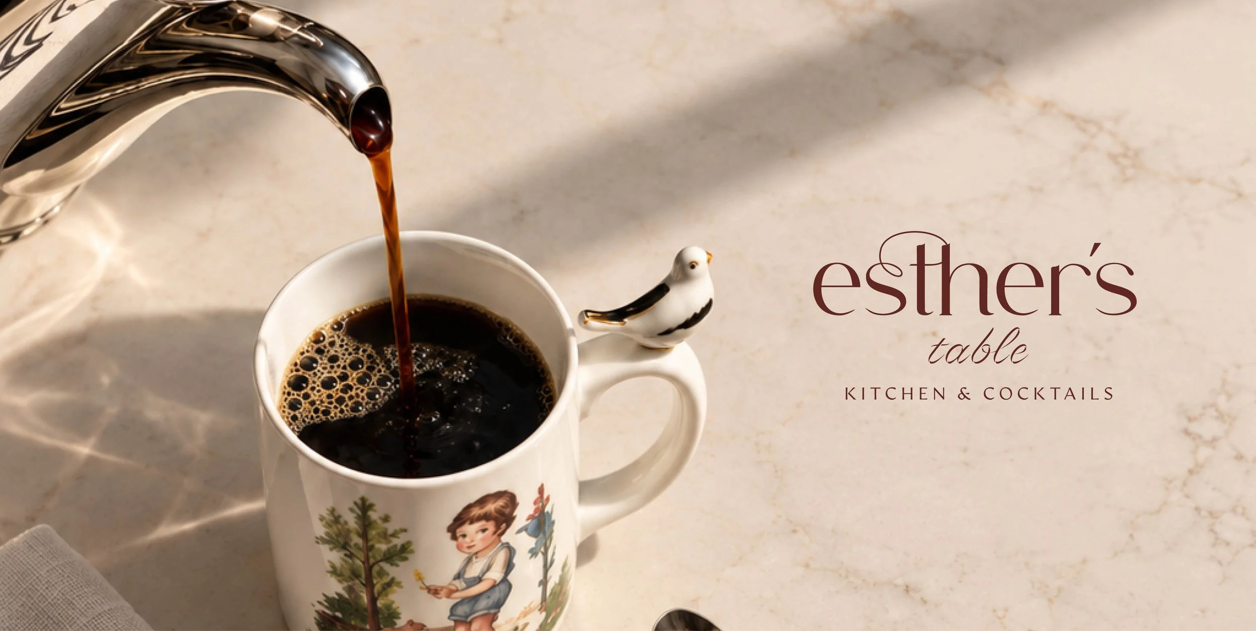
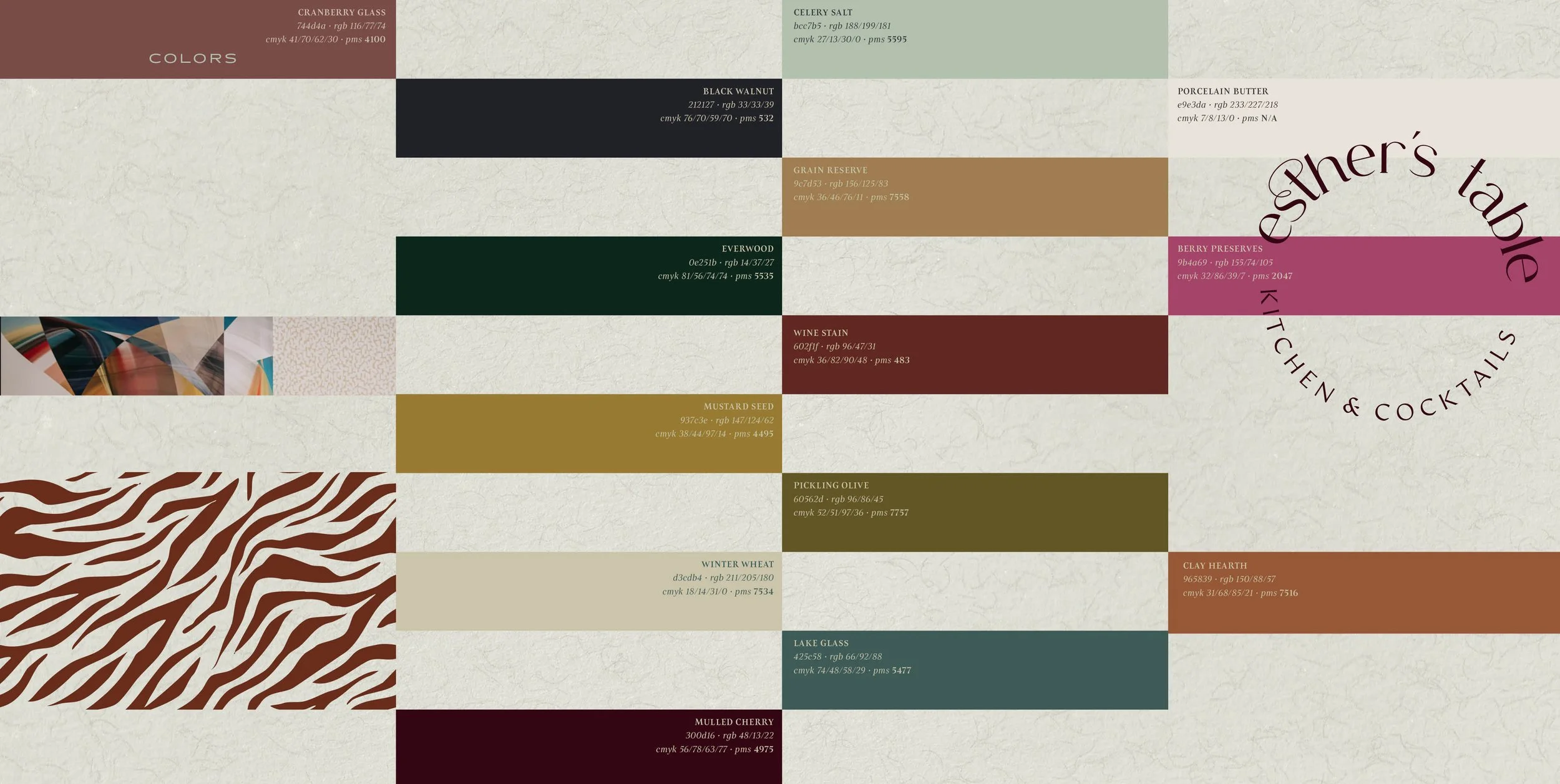
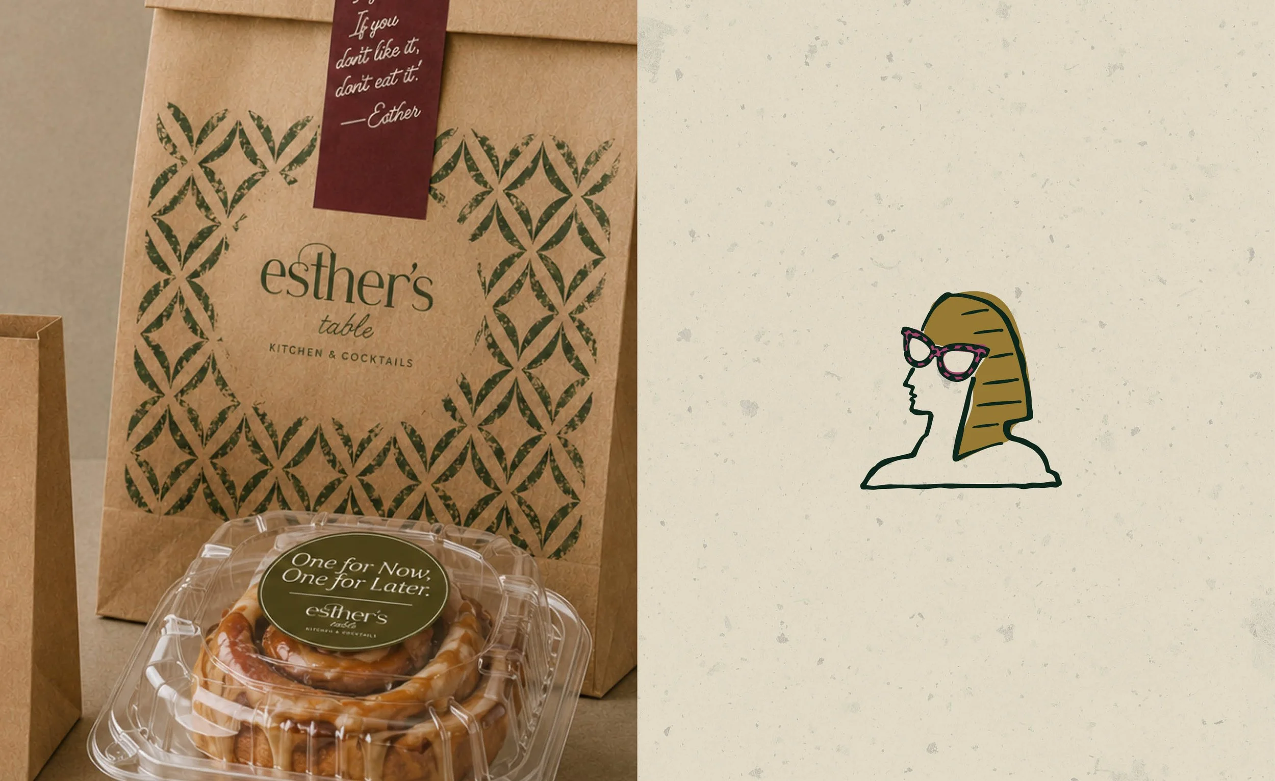
Inspired by Esther's eclectic personal style, love of color, worldly travels, and appreciation for beautiful things, the visual identity embraces a collected aesthetic that feels both nostalgic and refreshingly modern.
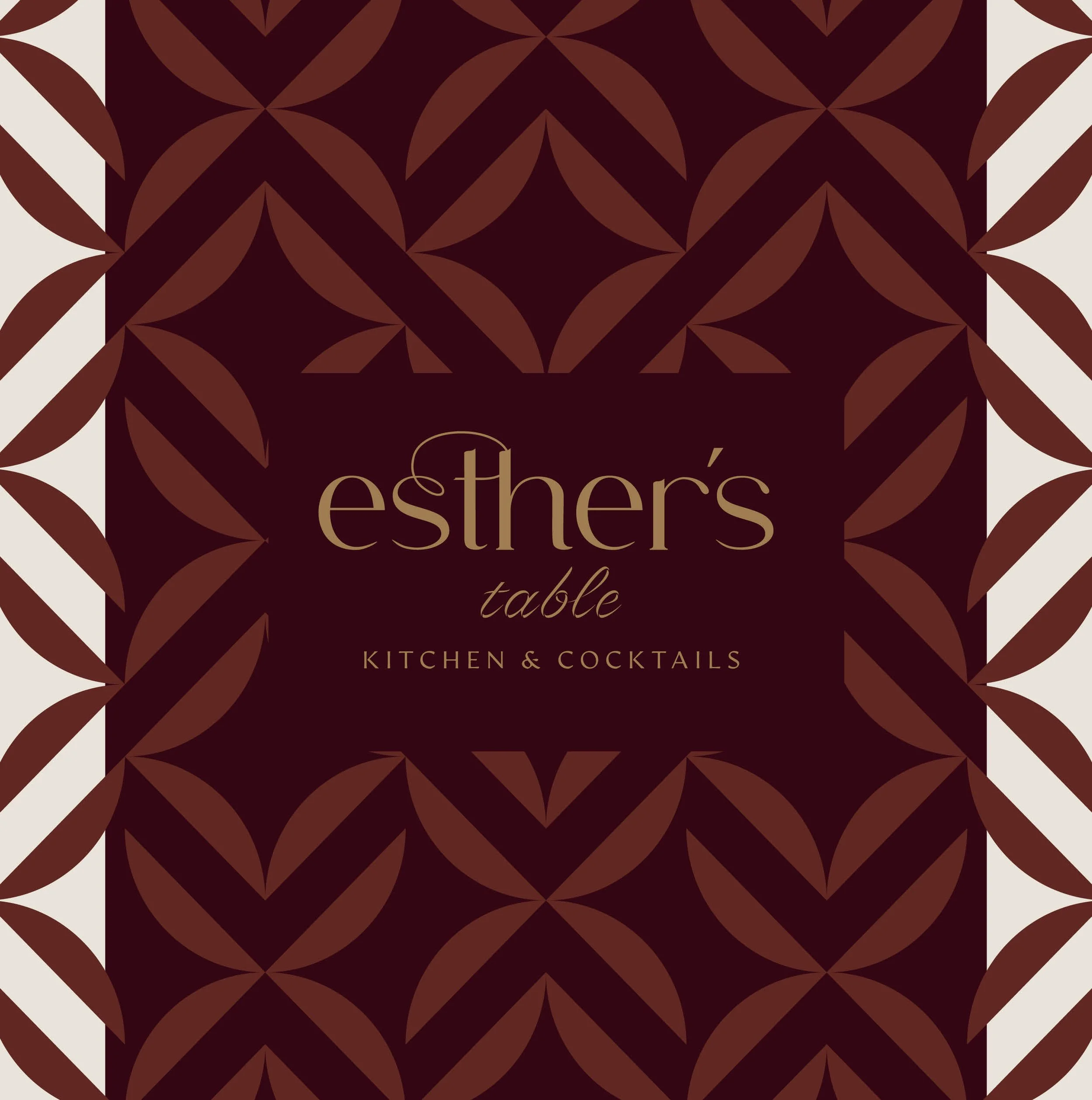
Expressive typography, unexpected patterns, playful illustrations, and layered graphic details create a visual world rich with personality. Inspired by vintage keepsakes, treasured objects, and the charm of things gathered over a lifetime, the identity balances thoughtful design with spontaneity.
The result is a brand that feels curated but never precious, polished but never predictable, and above all, unmistakably Esther.