

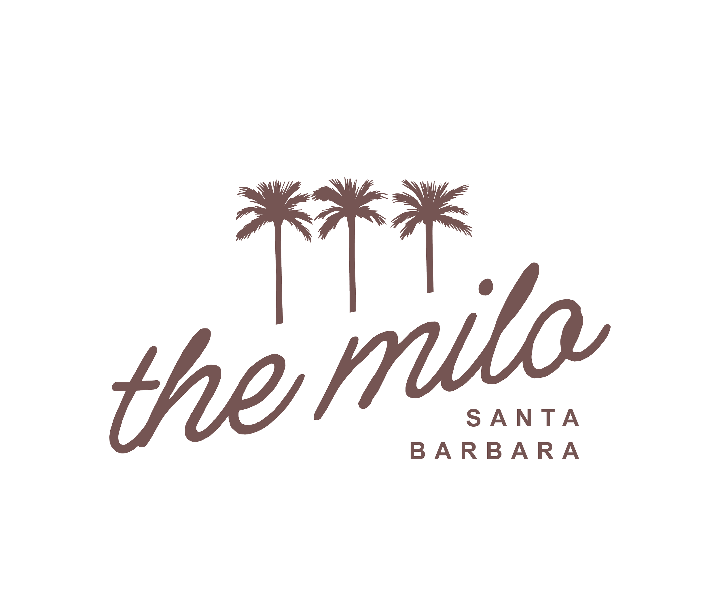
The Milo SANTA BARBARA
The Milo had all the ingredients…a storied past, a prime oceanfront location, and quiet charm, but lacked a cohesive identity to tie them together. The rebrand was a chance to move beyond generic coastal hospitality and craft a point of view that felt intentional, imaginative, and emotionally resonant for today’s traveler.
OUR SERVICES
DISCOVERY
Target Audience / Competitive Analysis / Perceptual Map
BRAND ARCHITECTURE
Brand Story / Brand Concept / Brand Pillars / Activations / Brand Personality / Brand Voice / Copywriting
VISUAL IDENTITY
Design Aesthetic / Logo Development / Collateral Design / Photography / Signage
THE CHALLENGE
SANTA BARBARA’S SEASIDE SECRET
Reposition a beachside property with historic roots and dated perception into a soulful boutique destination that speaks to modern luxury travelers, creative wanderers, and reflective escapists. The hotel required a brand with emotional depth and timeless appeal; something that could feel effortless yet curated, relaxed yet intentional.
Santa Barbara is no stranger to coastal charm. But in a sea of properties relying on location alone, The Milo needed to offer more than ocean views and Spanish tile. It needed identity. Soul. A story guests could step into and never quite step out of.
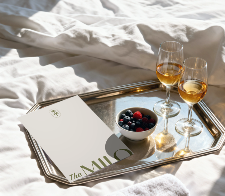
THE CONCEPT
PALM TREES & FORTUNE
We anchored the brand in the mythos of Milo Potter, an imagined 1902-era visionary whose curious spirit shaped the hotel’s identity. More than a namesake, Milo became the architect of the guest experience; charming, eccentric, and always one step ahead of the ordinary. His presence lingers in every detail, from handwritten welcome notes to a mysterious affection for the number 19.
The result was a modern-day fable disguised as a hotel; a poetic escape where every touchpoint feels intentional, every corner hides a secret, and every stay becomes a chapter in a much larger story.
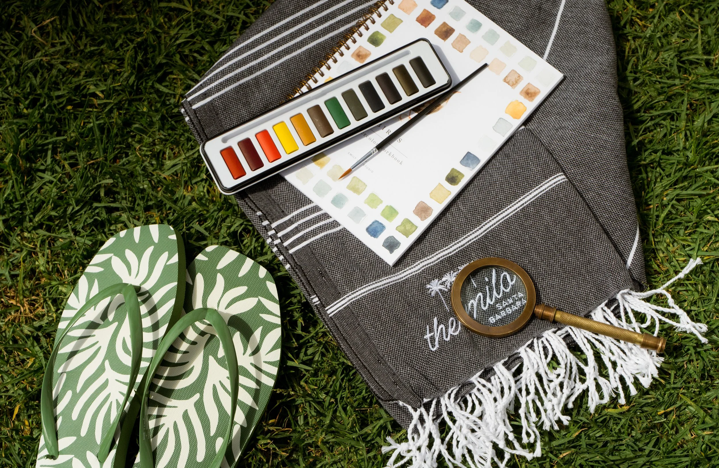
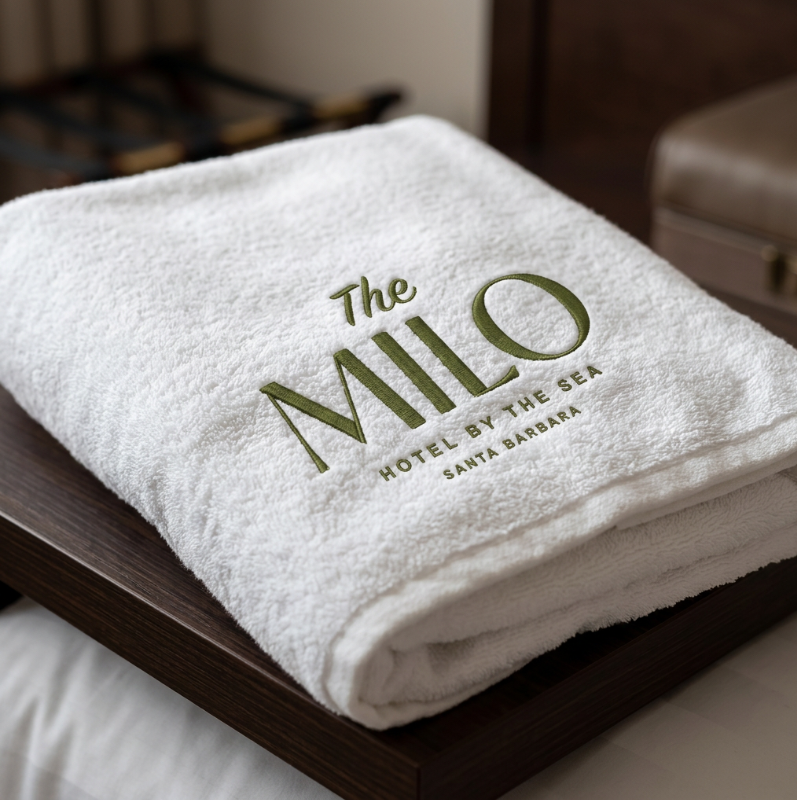

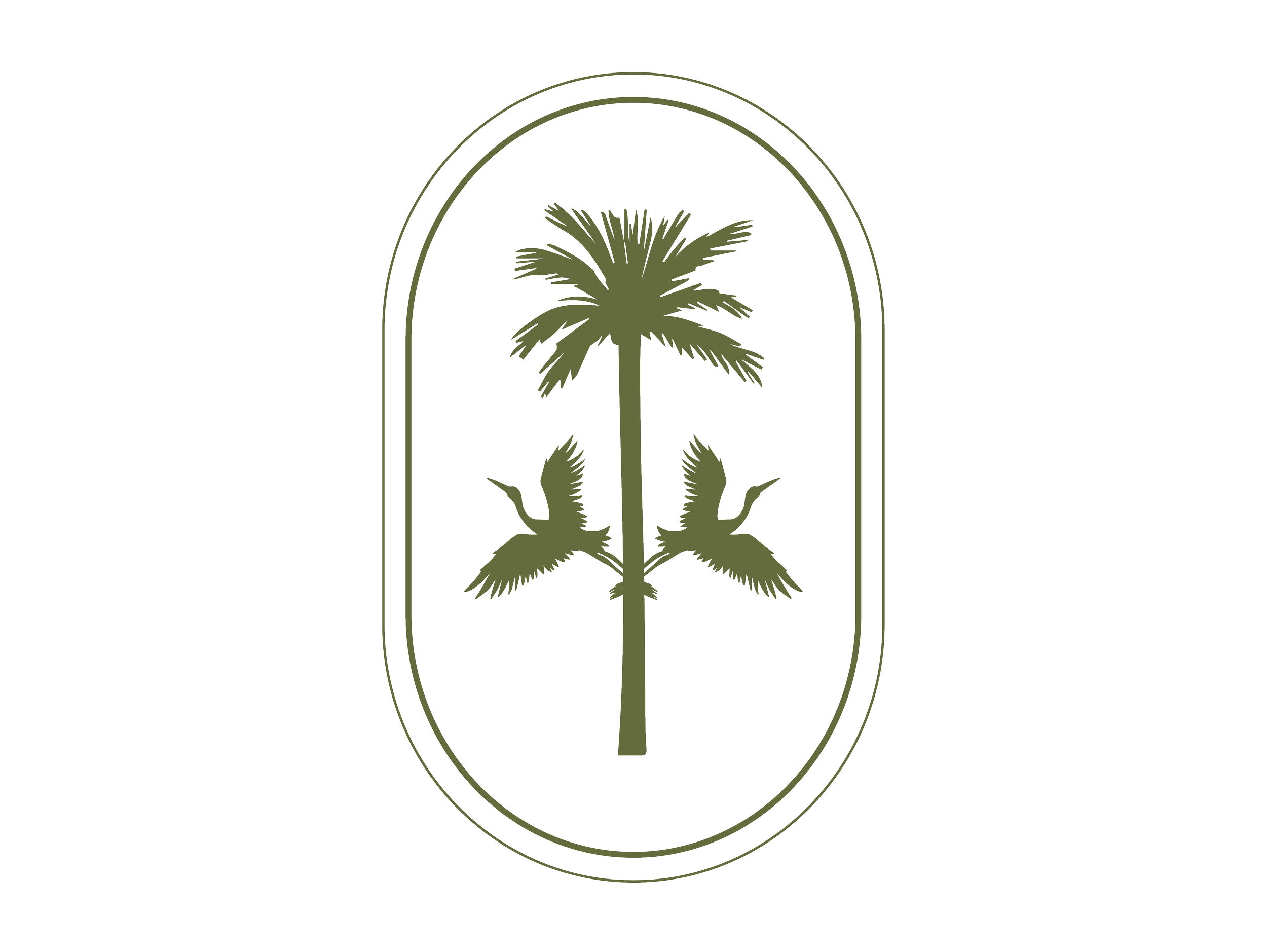
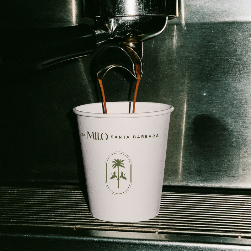
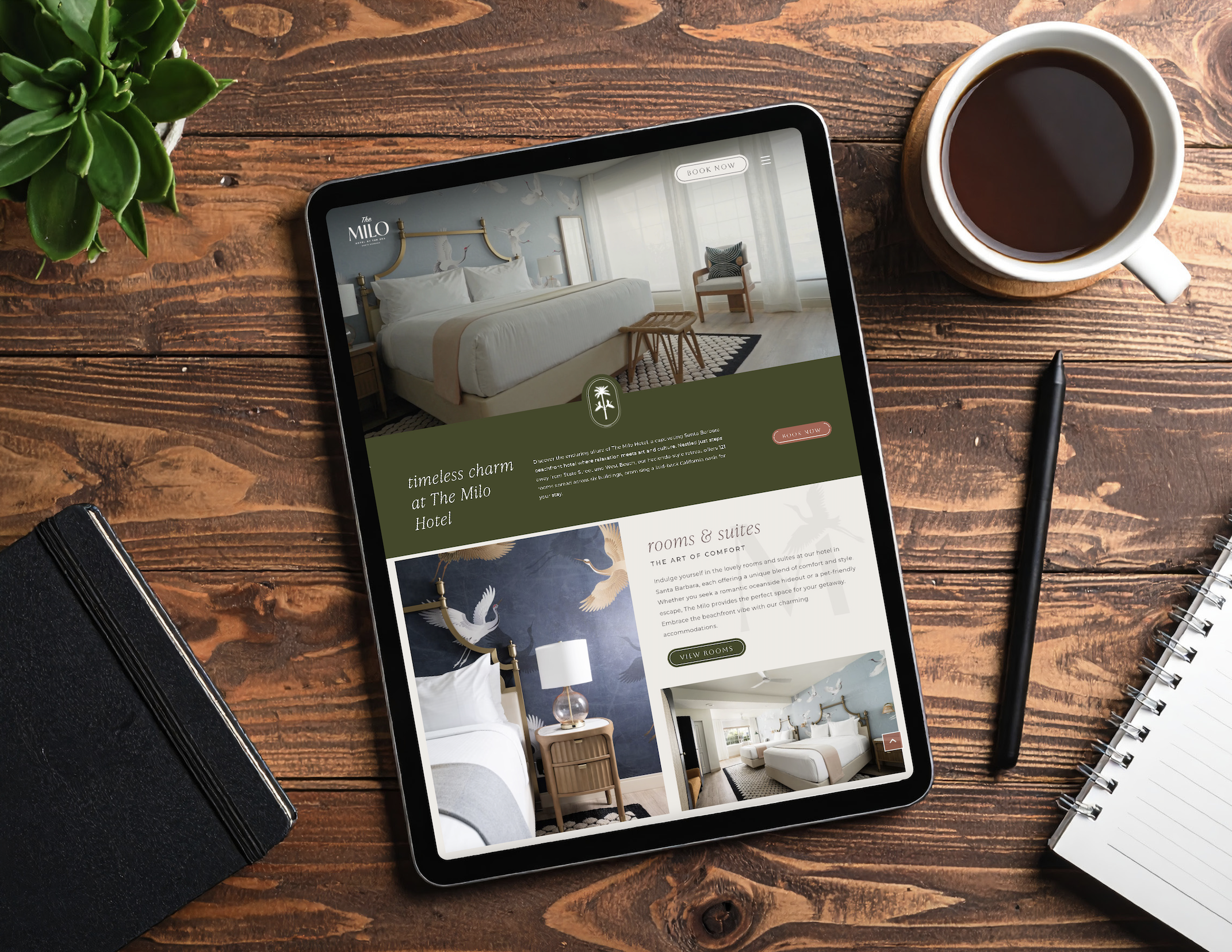
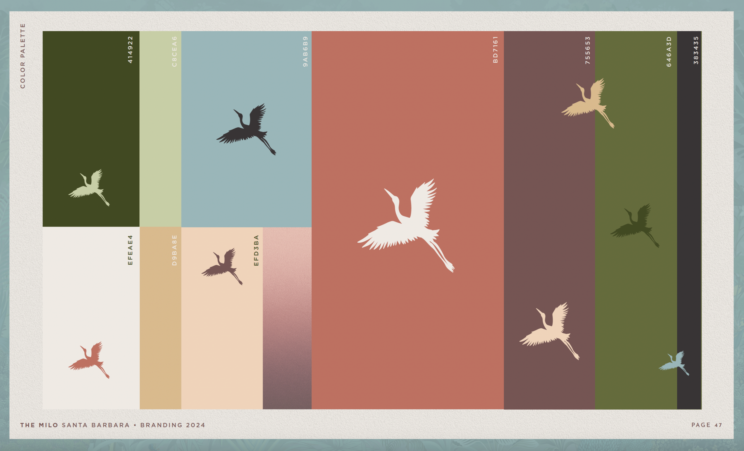
VISUAL LANGUAGE
A PLACE FOR POETS & DREAMERS
The Milo’s design system leans into textural nostalgia and quiet eccentricity. Interior cues, including sun-faded pinks, vintage wood, woven textures, and Spanish-style tiling, ground the space in its local past while inviting playful modern touches.
The logo and typography feature timeless fonts and inspiration drawn from old hotel signage, helping to reimagine the property as both a relic and a rebirth. Creative tensions, such as formal vs. casual and rustic vs. refined, guide every stylistic choice, allowing The Milo to feel layered without being fussy.