

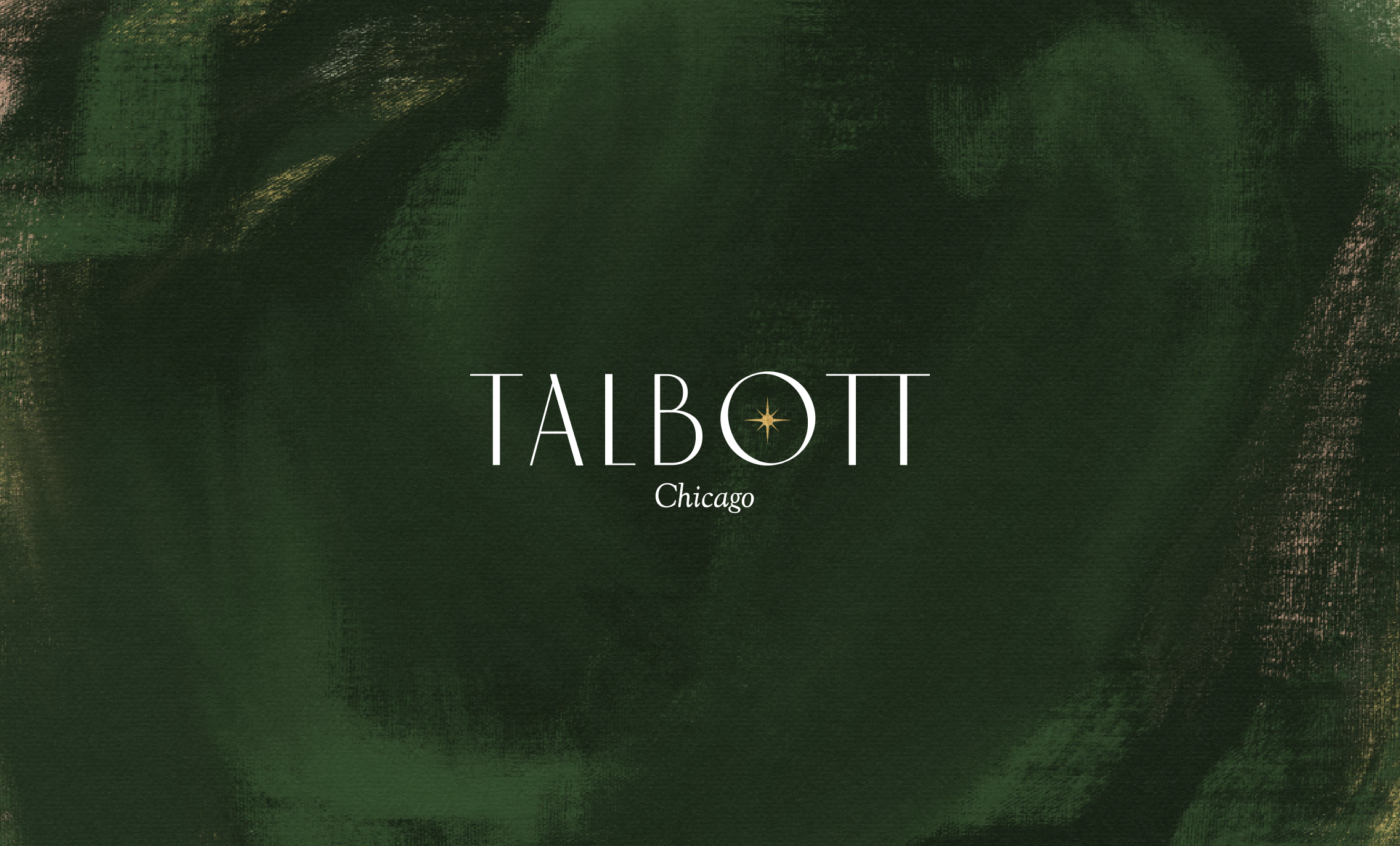
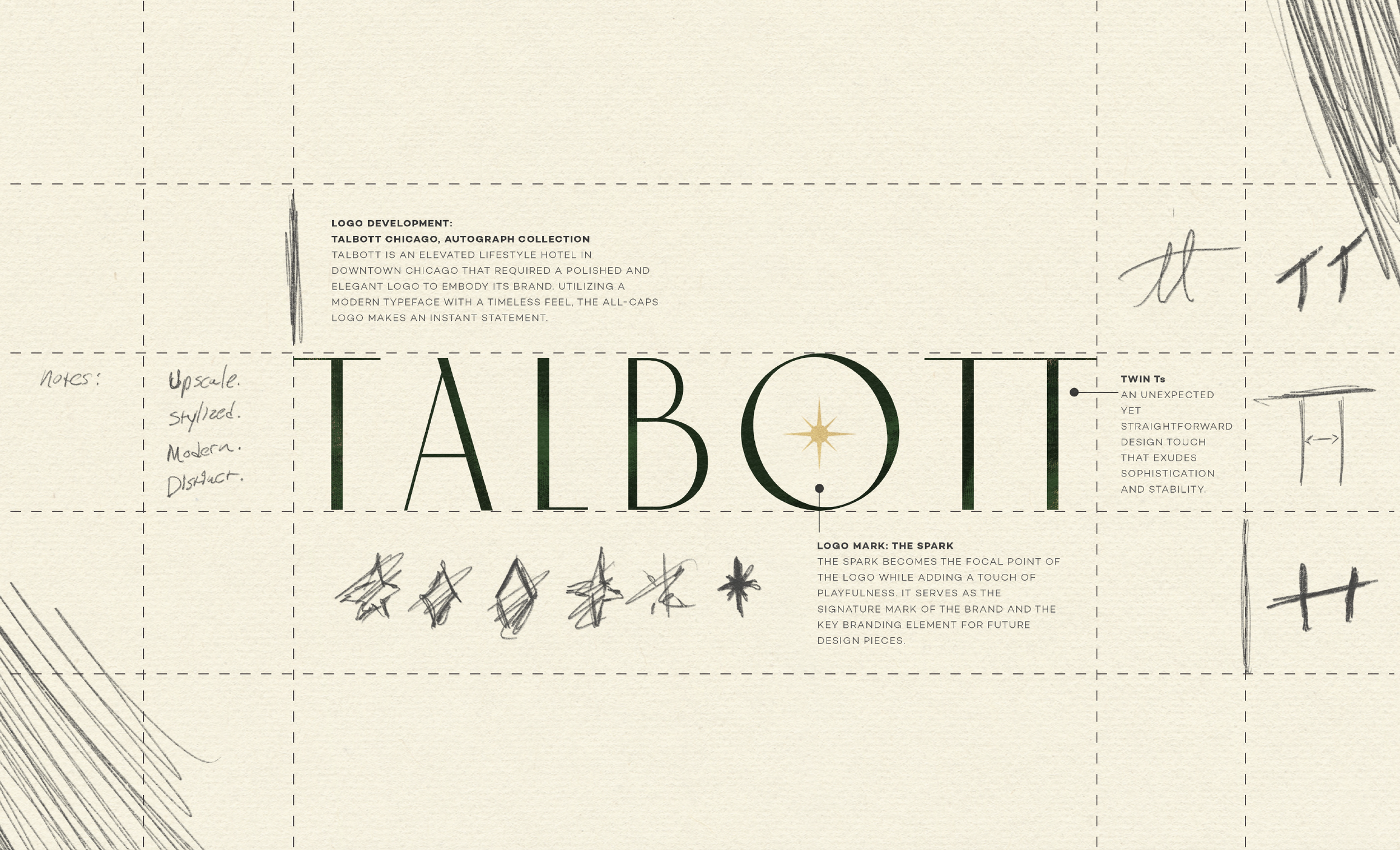
TALBOTT CHICAGO AUTOGRAPH COLLECTION
Talbott is a prominent hotel in the affluent Gold Coast of Chicago, IL. After being purchased by a new ownership group, Second Wave was brought on to develop a brand identity for the hotel to transition to an Autograph. Their aim as a reimagined and highly sought-after hotel needed an identity that was wholly unique as well as connected to the city’s people, history of art, and culture.
OUR SERVICES
BRAND STRATEGY
Target Audience / Competitive Analysis / Perceptual Map
BRAND ARCHITECTURE
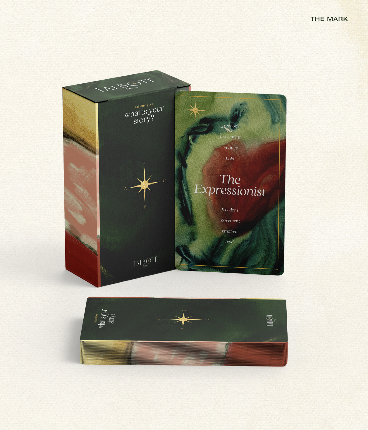
Brand Story / Brand Concept / Brand Pillars / Activations / Brand Personality / Brand Voice / Copywriting / Design + Development of The Mark (Autograph’s signature experience)
VISUAL IDENTITY
Design Aesthetic / Logo Development / Collateral Design
THE CHALLENGE
TALBOTT TAKES GOLD
The Gold Coast of Chicago is a highly affluent area with stiff competition in the hospitality space. This historic neighborhood is home to numerous high-end hotels, each offering unique luxury experiences. Competitors like Thompson Chicago, Eurostars Magnificent Mile, 21C Museum Hotel, and Viceroy Chicago cater to diverse and discerning travelers. Talbott Hotel must stand out amidst these well-established brands by delivering exceptional service and a distinctive, memorable experience that reflects the upscale charm of the Gold Coast.

THE CONCEPT
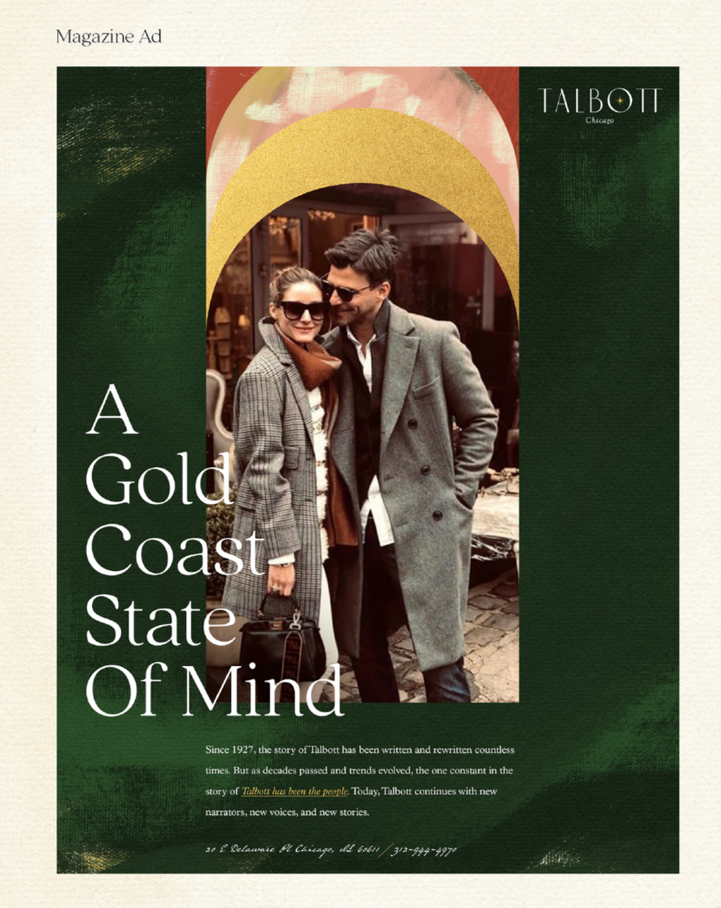
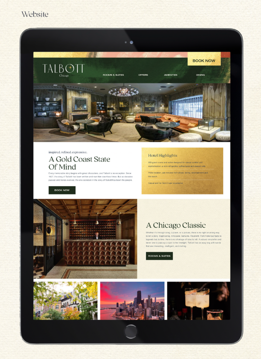
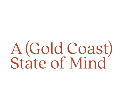
A GOLD COAST STATE OF MIND
Every memorable story begins with great characters, and Talbott is no exception. Since 1927, the story of Talbott has been written and rewritten countless times. But as decades passed and trends evolved, the one constant in the story of Talbott has been the people. The recurring guests. The indelible staff. The ones who called Talbott a home away from home. Today, Talbott continues with new narrators, new voices, and new stories. Talbott isn’t solely a story of the Gold Coast or a historic building; it is a story of people.
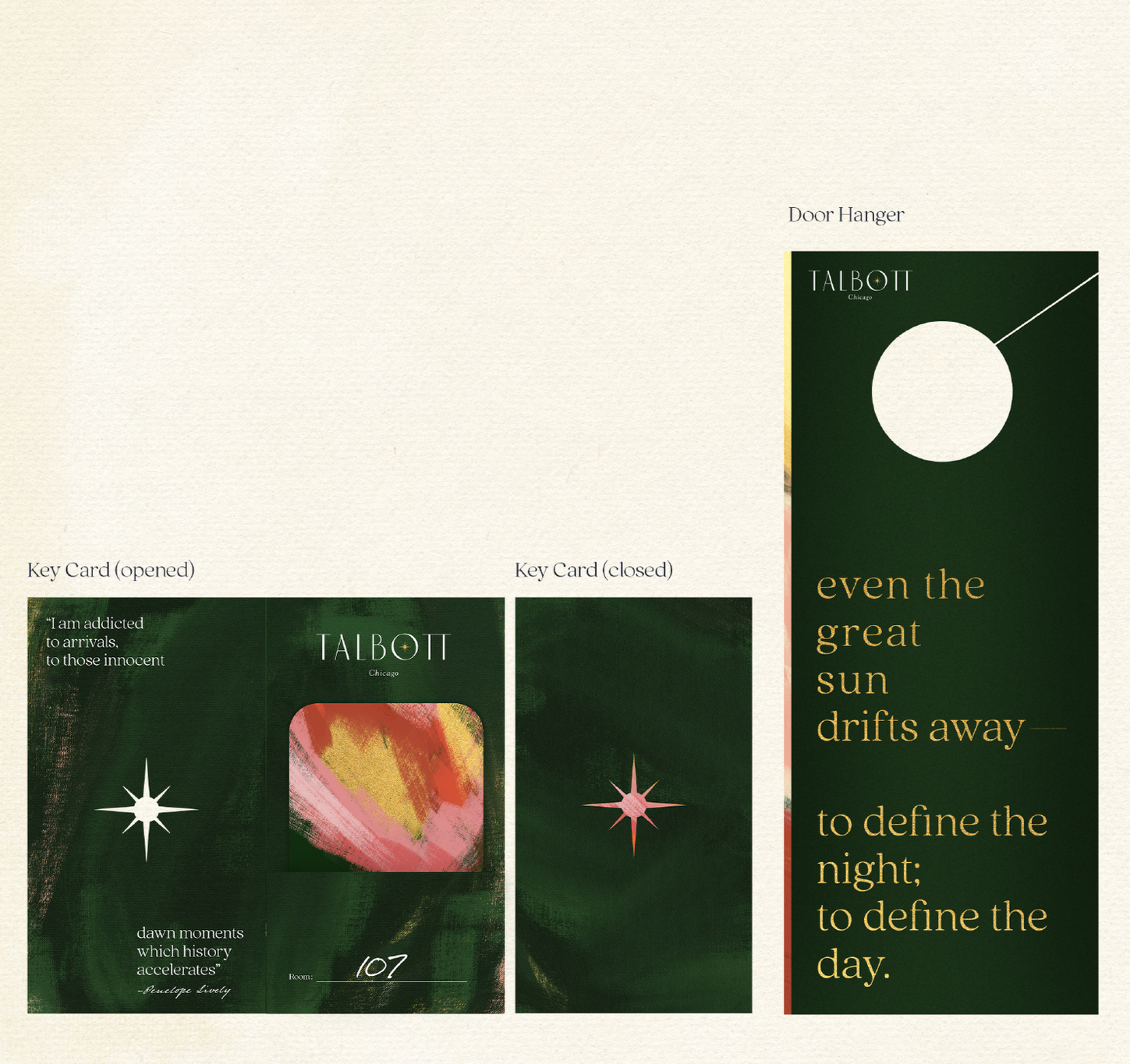
VISUAL LANGUAGE
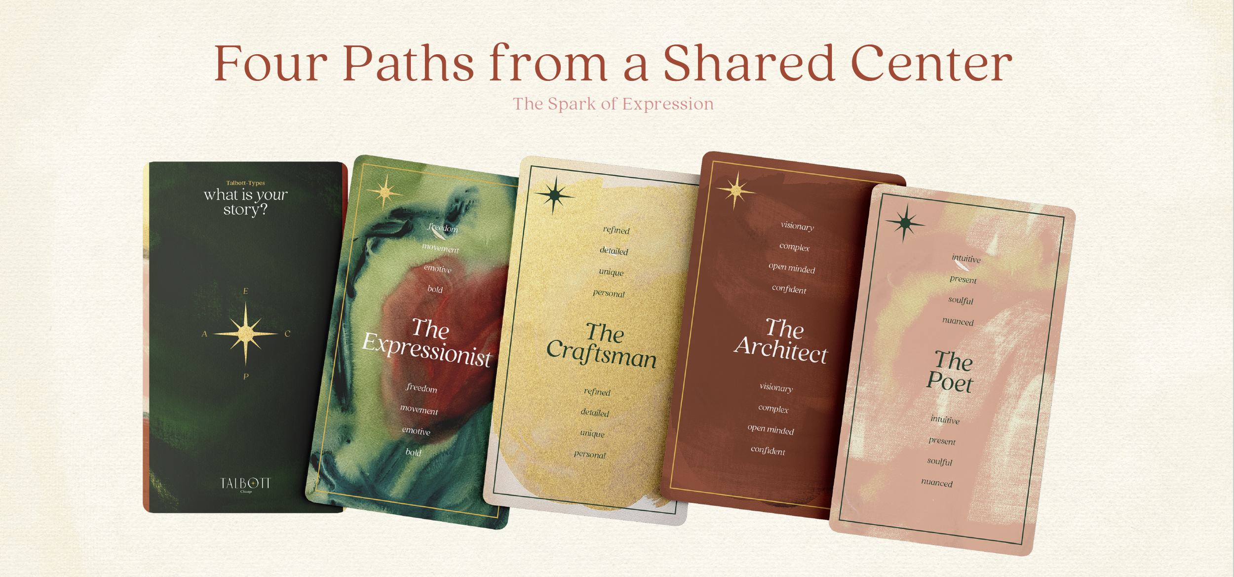
THE EXPRESSIONIST
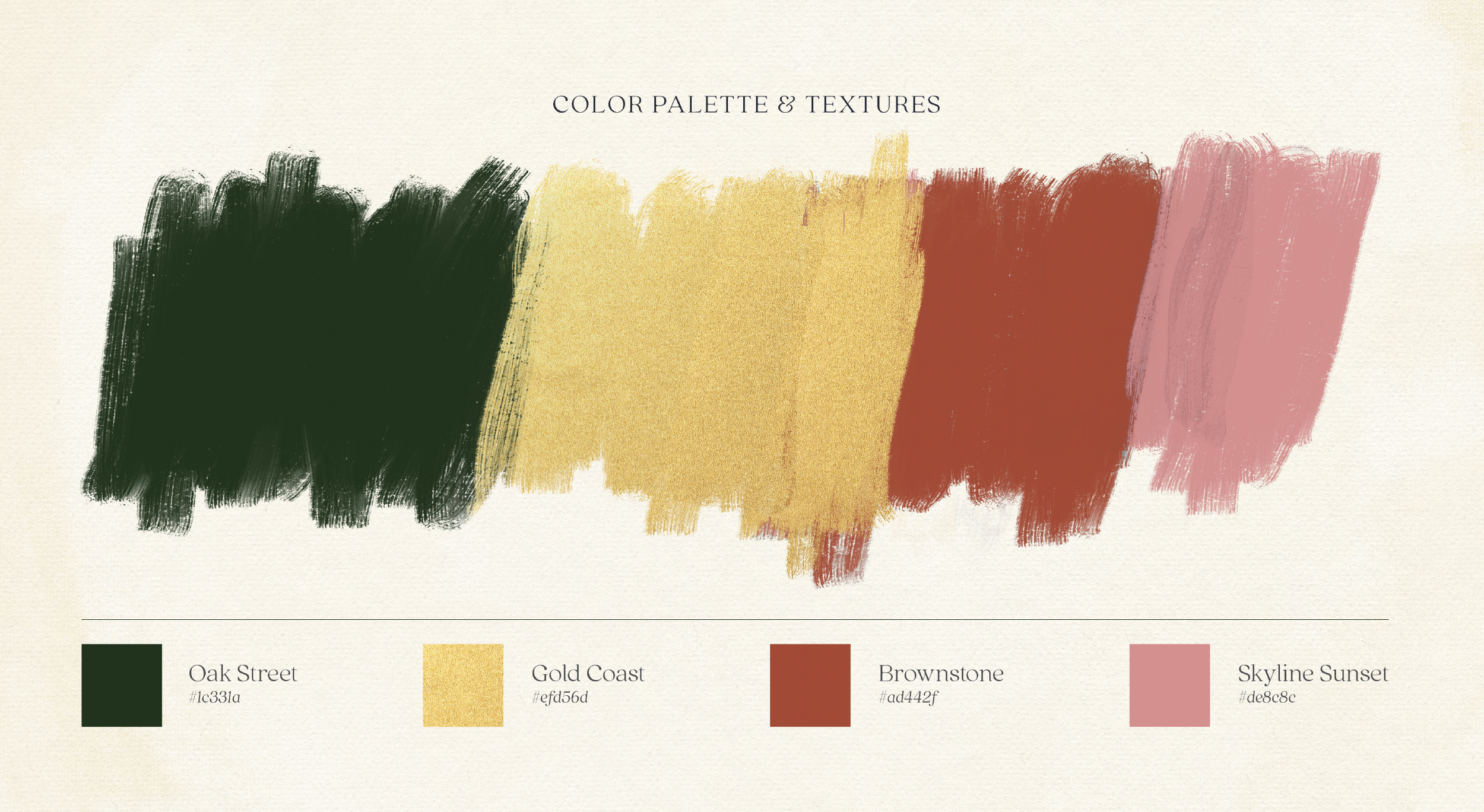
The visual vernacular of The Talbott draws directly from the character of the Gold Coast. Rich greens echo the tree-lined streets, while rustic brick tones reference the neighborhood’s historic brownstones. Decadent gold accents nod to the area’s legacy of understated luxury, complemented by soft pink hues inspired by the warmth of sunset. The result is a palette that feels minimalist, refined, and quietly striking.
Hand-painted elements are woven throughout the collateral suite, introducing texture, individuality, and a sense of craft. Typography balances literary influence with contemporary clarity, while a handwritten accent creates moments of intimacy and personality. Together, these elements reinforce the importance of the human touch…shaping a brand identity that feels expressive, lived-in, and distinctly personal.