
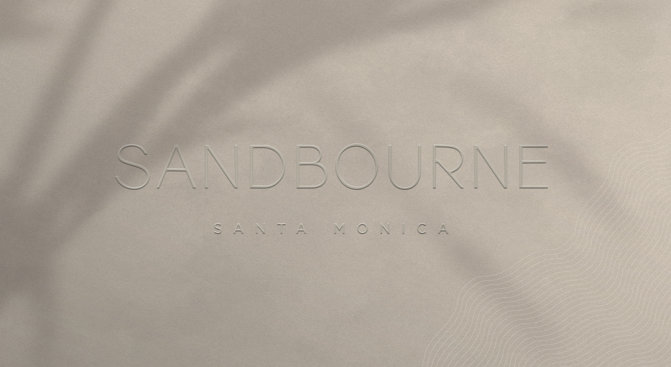
Sandbourne Santa Monica
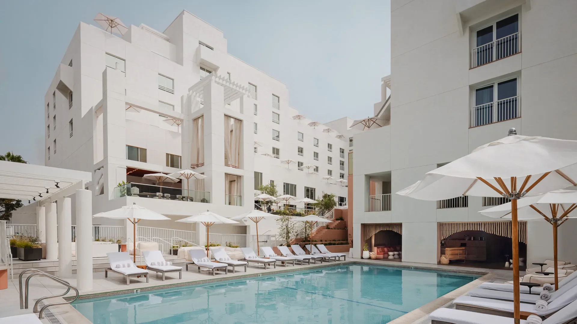
Sandbourne is a premier hotel situated in the vibrant Santa Monica area of Los Angeles County, known for its competitive hospitality landscape with iconic properties such as Shutters on the Beach right next door. Recently transitioning from a JW Marriott to an Autograph Collection hotel, Sandbourne sought a new brand identity that would distinguish it in this illustrious setting. The Second Wave team was entrusted with this transformation, crafting a brand concept that is an art all its own in a market dominated by passive luxury and tired icons
OUR SERVICES
DISCOVERY
Target Audience / Competitive Analysis / Perceptual Map
BRAND ARCHITECTURE
Brand Story / Brand Concept / Brand Pillars / Activations / Brand Personality / Brand Voice / Copywriting
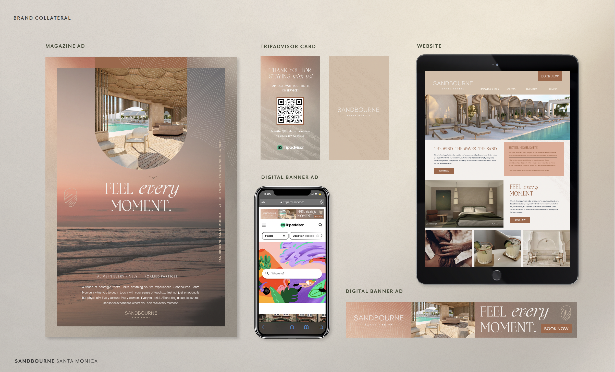
VISUAL IDENTITY
Design Aesthetic / Logo Development / Collateral Design / Photography / Signage
THE CHALLENGE
CROWDED SHORES
Santa Monica in Los Angeles County hosts a competitive array of luxury hotels, including Loews Santa Monica Beach Hotel, Fairmont Miramar, and Casa del Mar. These competitors emphasize traditional luxury but often lack a deeper, more engaging experience. Sandbourne aims to stand out by offering unparalleled service and a unique, memorable stay. Focusing on a tactile, sensory-rich environment that stimulates creativity and interaction, Sandbourne appeals to young affluent families, millennial travelers with resources, and creative professionals, providing a profound alternative to the passive luxury of its competitors.
THE CONCEPT
FEEL EVERY MOMENT
That first moment when your feet hit the sand. Each tiny grain tickles your nerve endings, sparking a visceral sensation. The warmth of the sun encapsulated in every mineral. The Pacific Ocean alive in every finely formed particle. The wind effortlessly coalesces memories of past travels with new ones yet to be made. It’s familiar but completely new. A touch of nostalgia that’s unlike anything you’ve experienced. Sandbourne Santa Monica invites you to get in touch with your sense of touch… to feel not just emotionally but physically. Every texture. Every element. Every material. All creating an undiscovered sensorial experience where you can feel every moment.
PRESS: Flaunt | Hospitalitynet
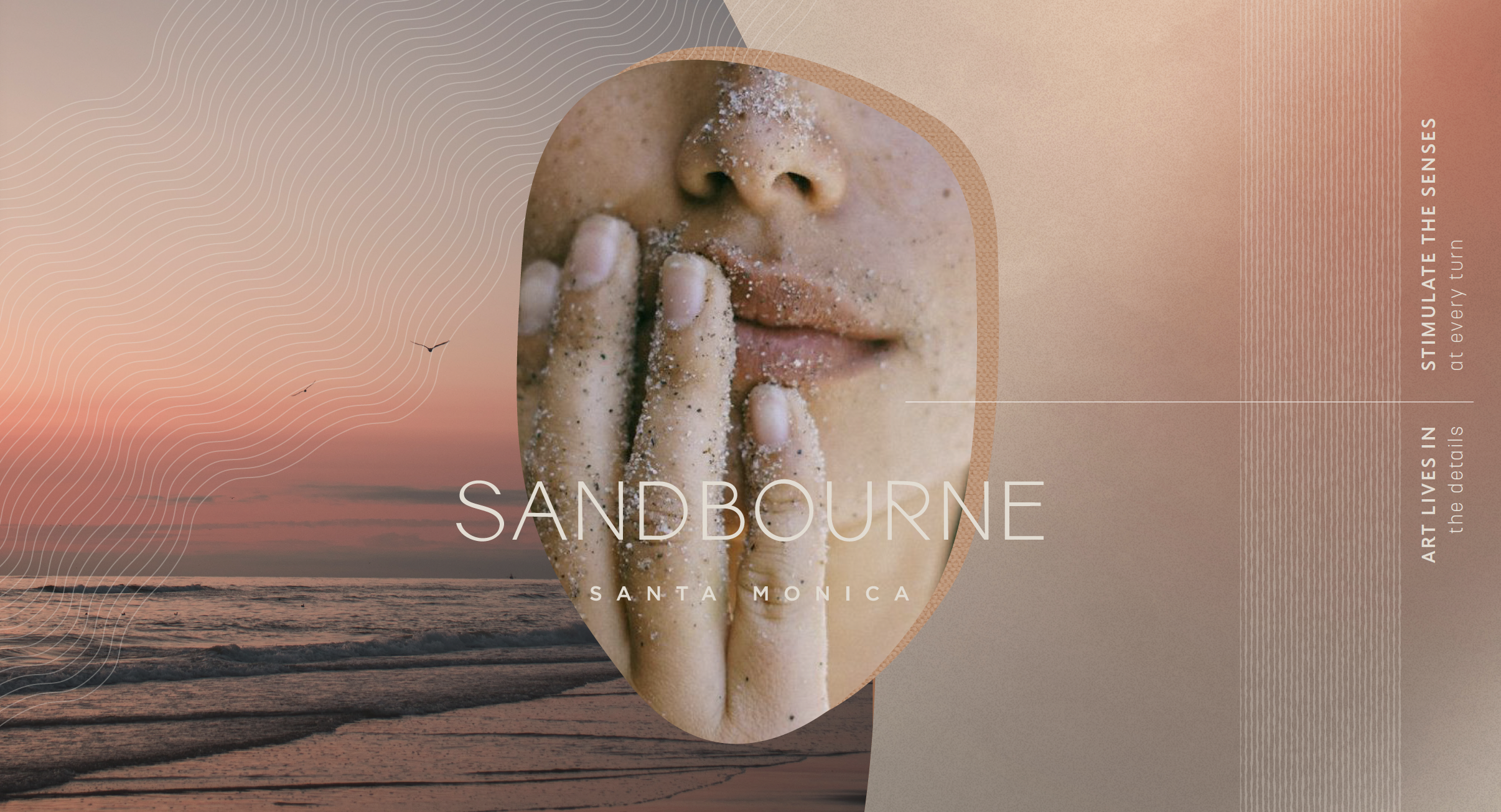
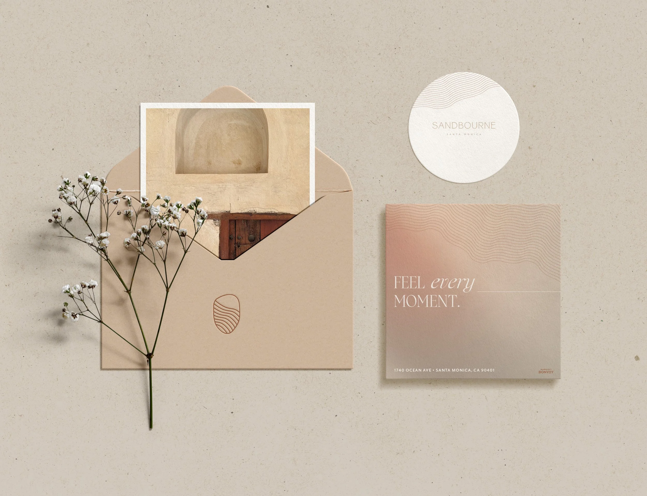
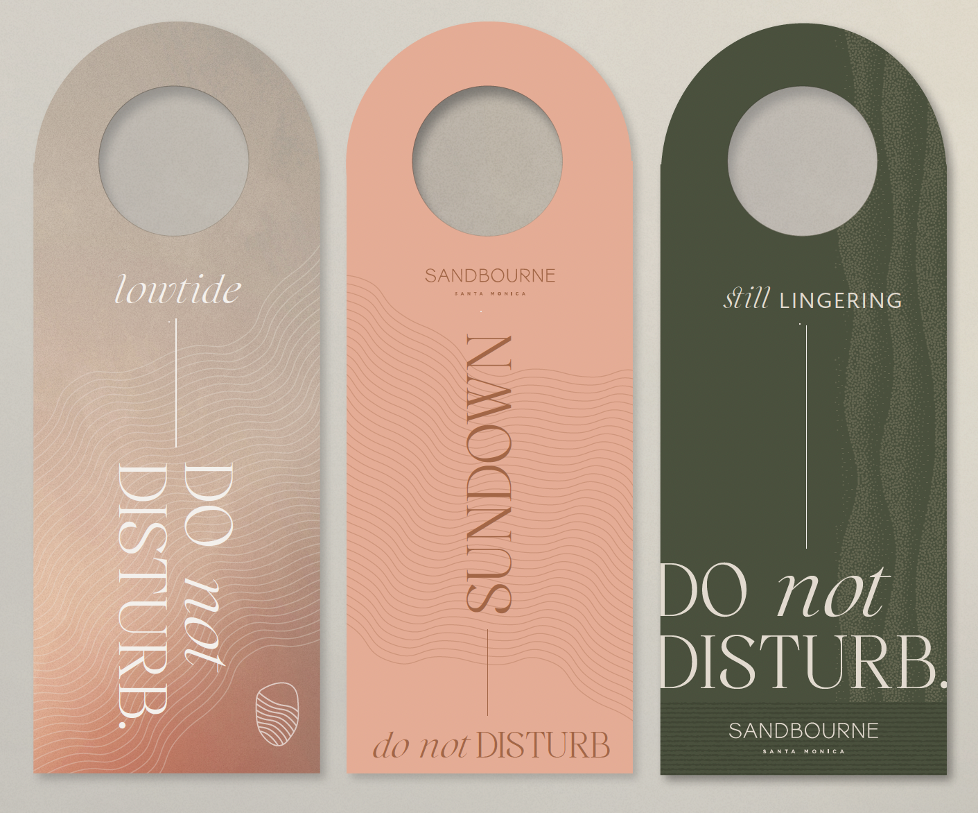
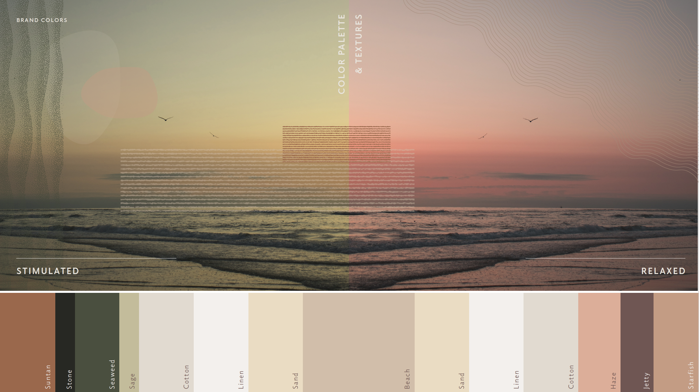
VISUAL LANGUAGE
THE KINESTHETIC
Staying true to Sandbourne's focus on the sensory experience of touch, our approach to design revolves around offering a physically engaging, lively blend of elements that echo the dynamic spirit of Santa Monica.
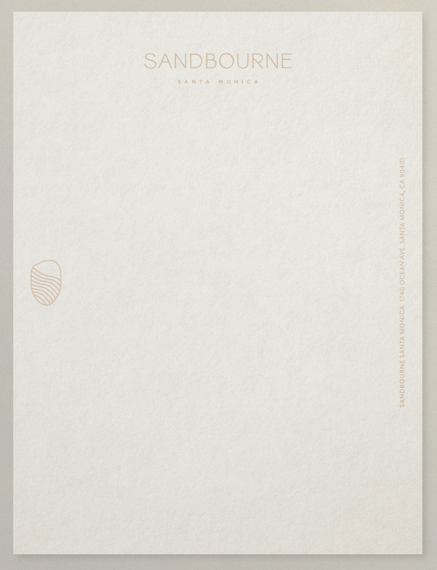
For our design materials, we worked with an exciting array of techniques like embossing and debossing to invoke a tangible, three-dimensional effect. Mixing in various textured papers reflected the diversity inherent to Sandbourne. Adding an interactive touch, we introduced thermochromic paper that shifts its color upon contact.
When it came to fonts, we primarily used minimalistic sans-serif types for their clean, contemporary feel. To anchor these, we chose an elegant serif font to effectively convey Sandbourne's brand tone. The hotel's distinct logo mark is inspired by a unique mirror found in every room, merged subtly with abstract representations of shore-lines.
This overall tactile approach to design enhances Sandbourne's brand identity and pays homage to our key tenet of engaging with the sense of touch.