


THE QUEEN MARY LONG BEACH
In the wake of the pandemic and management upheavals, the future of The Queen Mary, once a celebrated symbol of transatlantic travel, faced an uncertain future. However, the city of Long Beach, California, made a decisive move to not merely salvage this maritime icon, but to transform it into a beacon of timeless elegance and heritage on the Southern California Coast.
OUR SERVICES
DISCOVERY
Target Audience / Competitive Analysis / Perceptual Map
BRAND ARCHITECTURE
Brand Story / Brand Concept / Brand Pillars / Activations / Brand Personality / Brand Voice / Copywriting
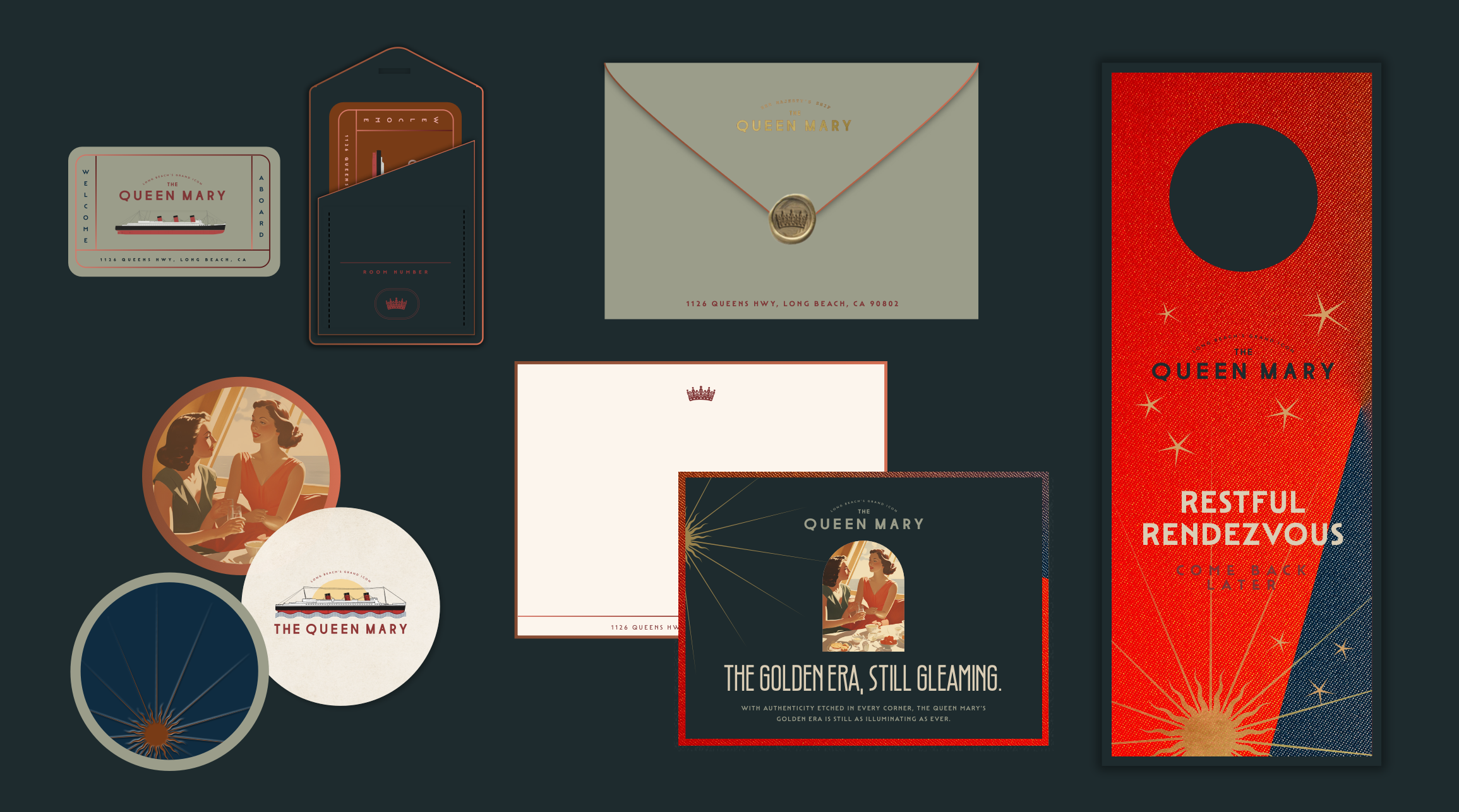
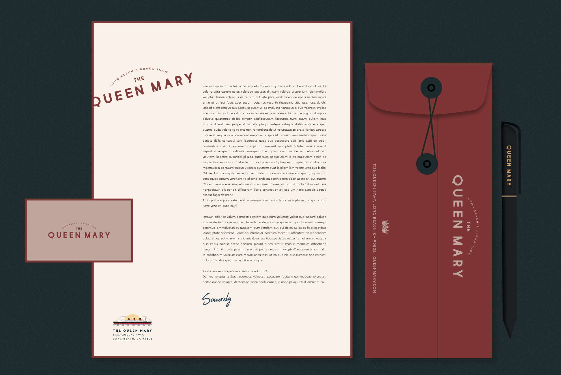
VISUAL IDENTITY
Design Aesthetic / Logo Development / Collateral Design / Photography / Signage
THE CHALLENGE
REFORGING A MARITIME ICON
Rebranding an icon like The Queen Mary goes beyond updating a style. It's about bridging her illustrious past with a contemporary future. As time progresses, the legends of such icons can recede from their original spirit. Holding onto her classic essence while infusing modern relevancy becomes critical. It's not just about improving her visual appeal but reigniting her narrative, making her as compelling to today’s audience as she was to her past voyagers. This balance, this blend of timeless elegance and present-day vibrancy, is the heart of the challenge.
THE CONCEPT
A VIVID CONNECTION TO A BYGONE ERA
The Queen Mary blends yesterday’s charm with today’s vitality. It vibrates with timeless innovation, authenticity, culture, and wisdom that surpasses time. More than just a ship, The Queen Mary carries a spirit passed through generations. It’s where historical charm meets the present, turning new experiences into future histories. It provides an immersive journey that captures the tangible and intangible elements of our collective history and societal evolution.
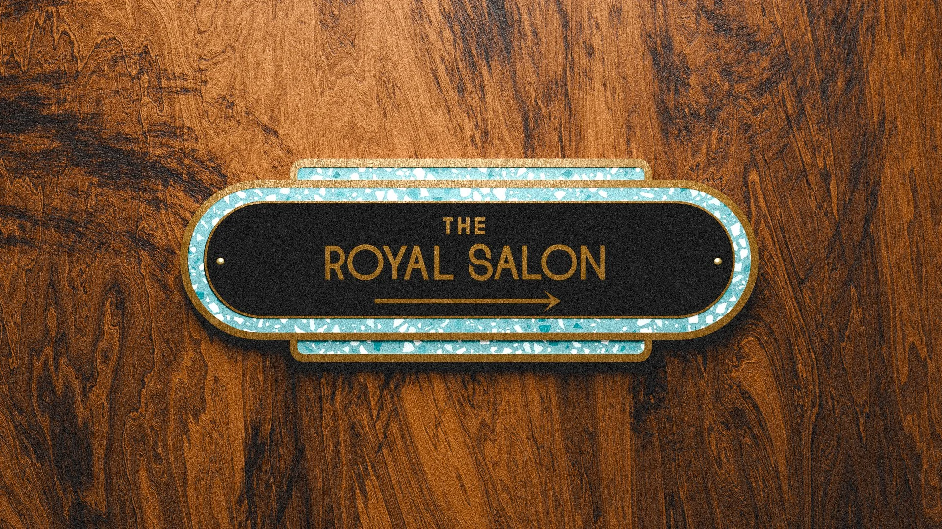
VISUAL LANGUAGE
THE VINTAGE VANGUARD
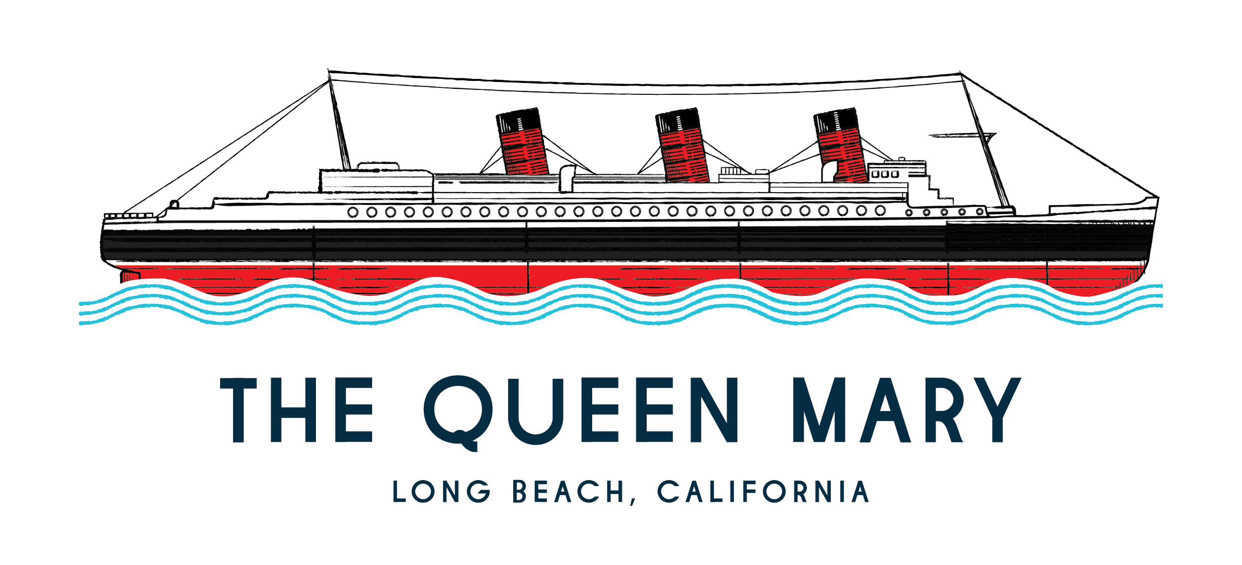
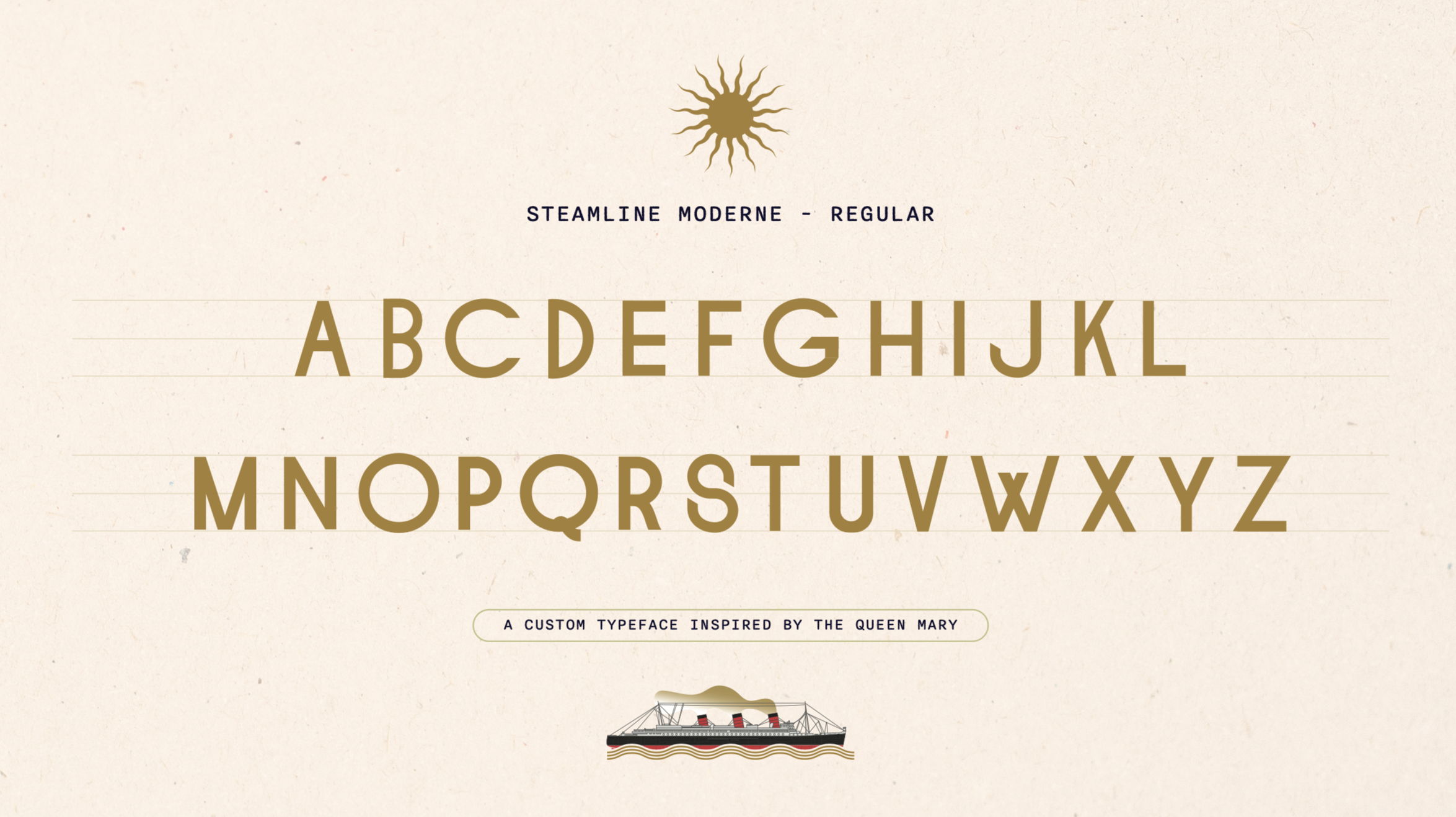
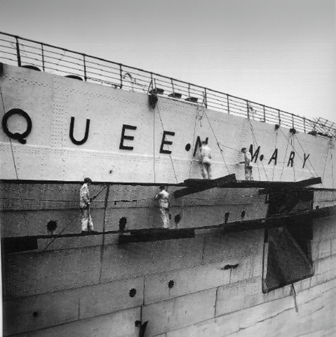
The paramount task in visually rebranding The Queen Mary was to restore her to her former splendor of Streamline Moderne design, but with a contemporary edge. We aimed to strike a balance between her glorious history and the present-day expectations of style and vibrancy.
Relentless in our pursuit of authenticity, we replaced the "retro-like" elements in favor of true Streamline Moderne fonts—to the point of taking the actual lettering off the side of the sip and creating a signature font suite for all Queen’s wayfinding signage. In doing so, we brought forward the elegance and equilibrium that are the hallmarks of Streamline Moderne designs, significantly elevating The Queen Mary's brand aesthetics.
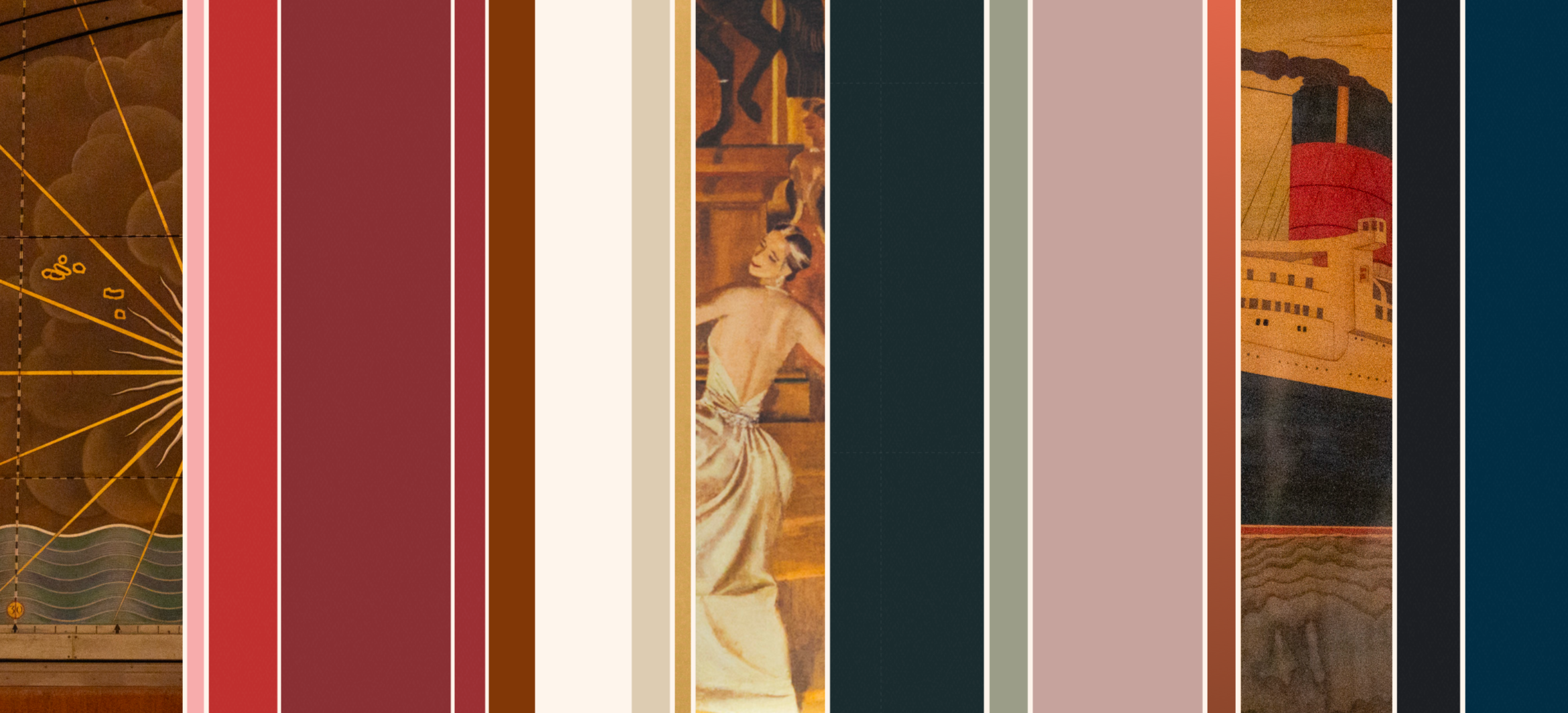
Additionally, while past representations of the brand concentrated on the facade's white, red, and black palette, we saw an opportunity to show off the ship's interior richness. We sought to spotlight the vibrant array of colors and textures within this grand dame's walls. This shift not only complements her facelift but further highlights her interior elegance and gives her a much-deserved moment in the spotlight.