


KISSEL
Kissel Uptown Oakland, Unbound by Hyatt is a reawakening of a landmark…a historic Auto Row showroom transformed into a modern hospitality destination with a story still humming beneath the surface. Rooted in the legacy of the Kissel Motor Car Company, the brand bridges Oakland’s past and present with equal parts reverence and energy. What once sold motion now lives it.


OUR SERVICES
BRAND STRATEGY
Target Audience / Competitive Analysis / Location Study / Perceptual Map / Naming (for the hotel, rooftop bar, and café)
BRAND ARCHITECTURE
Brand Concept / Story / Pillars / Personality / Activations / Voice / Copywriting
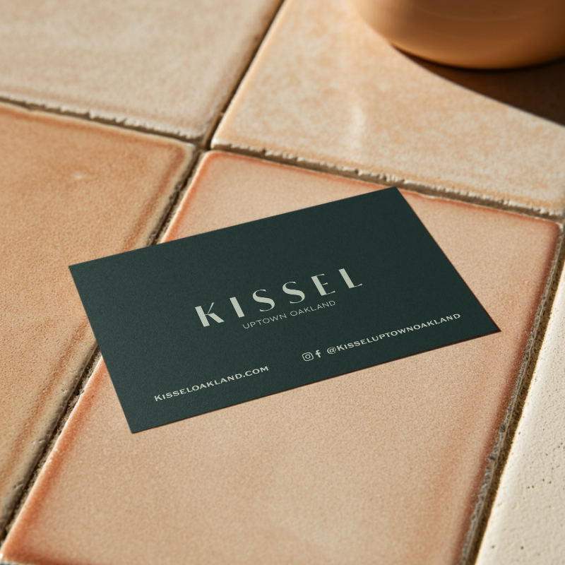
VISUAL IDENTITY
Logo Suite / Color Palette & Textures / Typography / Photography Direction / Signage / Uniforms / Collateral
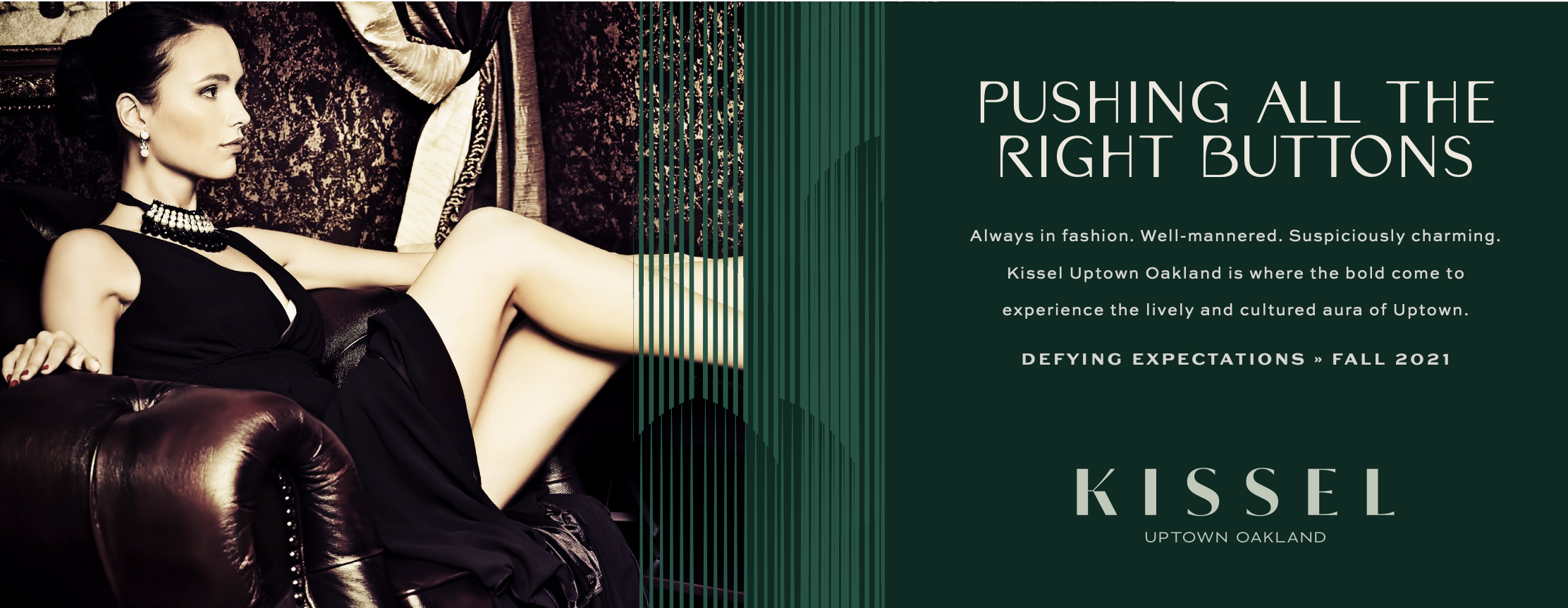
THE CHALLENGE
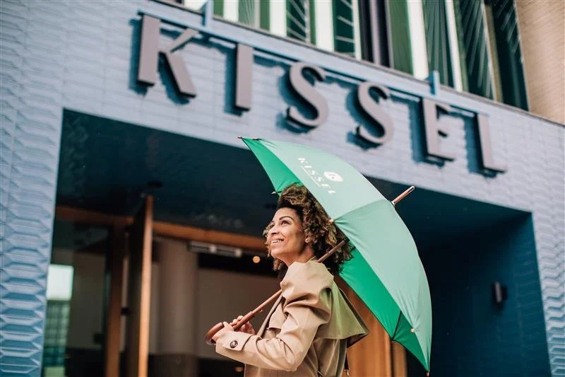
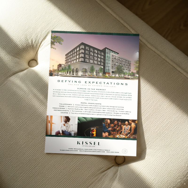
DEFYING EXPECTATIONS
The building came with history baked into its bones, but history alone doesn’t fill rooms. The challenge was to honor the integrity of the original structure and its automotive legacy without drifting into nostalgia or cliché. At the same time, the brand needed to feel distinctly Oakland…creative, cultural, and alive…while raising the bar for luxury in the market.

THE CONCEPT
ON THE SHOWROOM FLOOR
We didn’t invent a story…we uncovered one and turned the ignition. The Kissel name became the anchor, reframed not as a relic but as a symbol of craftsmanship, progress, and forward motion. The concept lives in that tension…heritage and momentum, grit and polish, analog soul and modern energy. This extended beyond the hotel into its outlets: Otto’s Café, a grounded, neighborhood-driven expression of the brand’s roots, and High Five Rooftop Bar, a lifted, celebratory counterpoint that captures Oakland’s social spark. Together, the experience moves like the city itself…layered, dynamic, and always in motion.

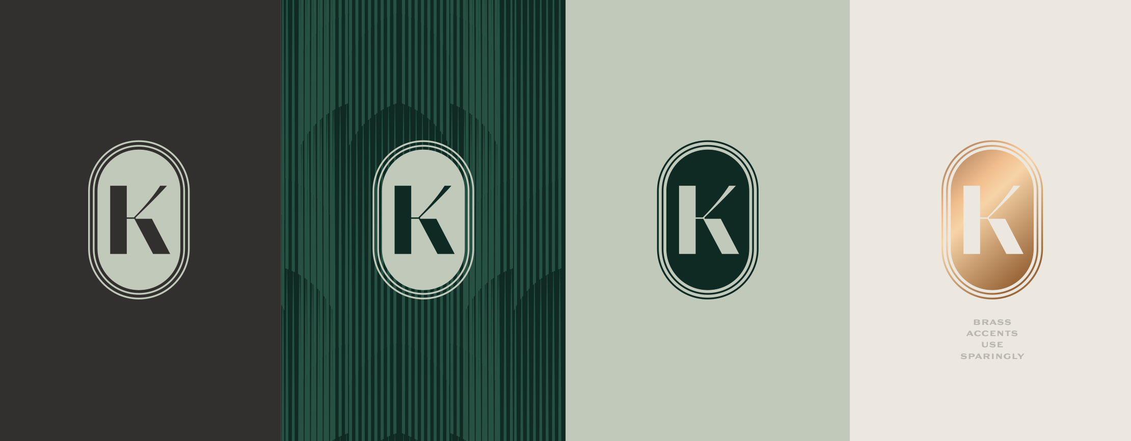
VISUAL LANGUAGE
CRAFTED URBAN STYLE
The visual identity draws from the precision and elegance of early automotive design, reinterpreted through a contemporary lens. Typography balances vintage character with modern restraint, while the palette pulls from industrial tones and refined metallics. Architectural details from the original façade informed graphic motifs and framing devices, creating a system that feels both structural and expressive. Across collateral, signage, and digital, the brand maintains a sense of rhythm and movement…never static, always progressing.