


HAYES MANSION, CURIO COLLECTION
Hayes Mansion, a historic estate in San Jose and part of the Curio Collection by Hilton, engaged Second Wave to help realign its brand with the experience guests actually encounter on property. The goal was not reinvention, but clarification…sharpening the story, language, and identity to better reflect the mansion’s legacy, sense of place, and role as a destination for gathering.
OUR SERVICES
BRAND STRATEGY
Target Audience / Competitive Analysis / Location Study / Perceptual Map
BRAND ARCHITECTURE
Brand Concept / Brand Pillars / Activations / Voice / Copywriting
VISUAL IDENTITY
Design Aesthetic / Color Palette & Textures / Typography / Photography Direction / Collateral
THE CHALLENGE
A HISTORIC PRIVATE ESTATe
Despite its architectural significance, expansive grounds, and strong performance in weddings and groups, Hayes Mansion struggled with unclear positioning. Inconsistent language, which created mismatched guest expectations and limited its ability to stand apart from downtown hotels and true destination retreats. The challenge was to unify perception, purpose, and promise without over-selling or ignoring operational realities.

THE CONCEPT
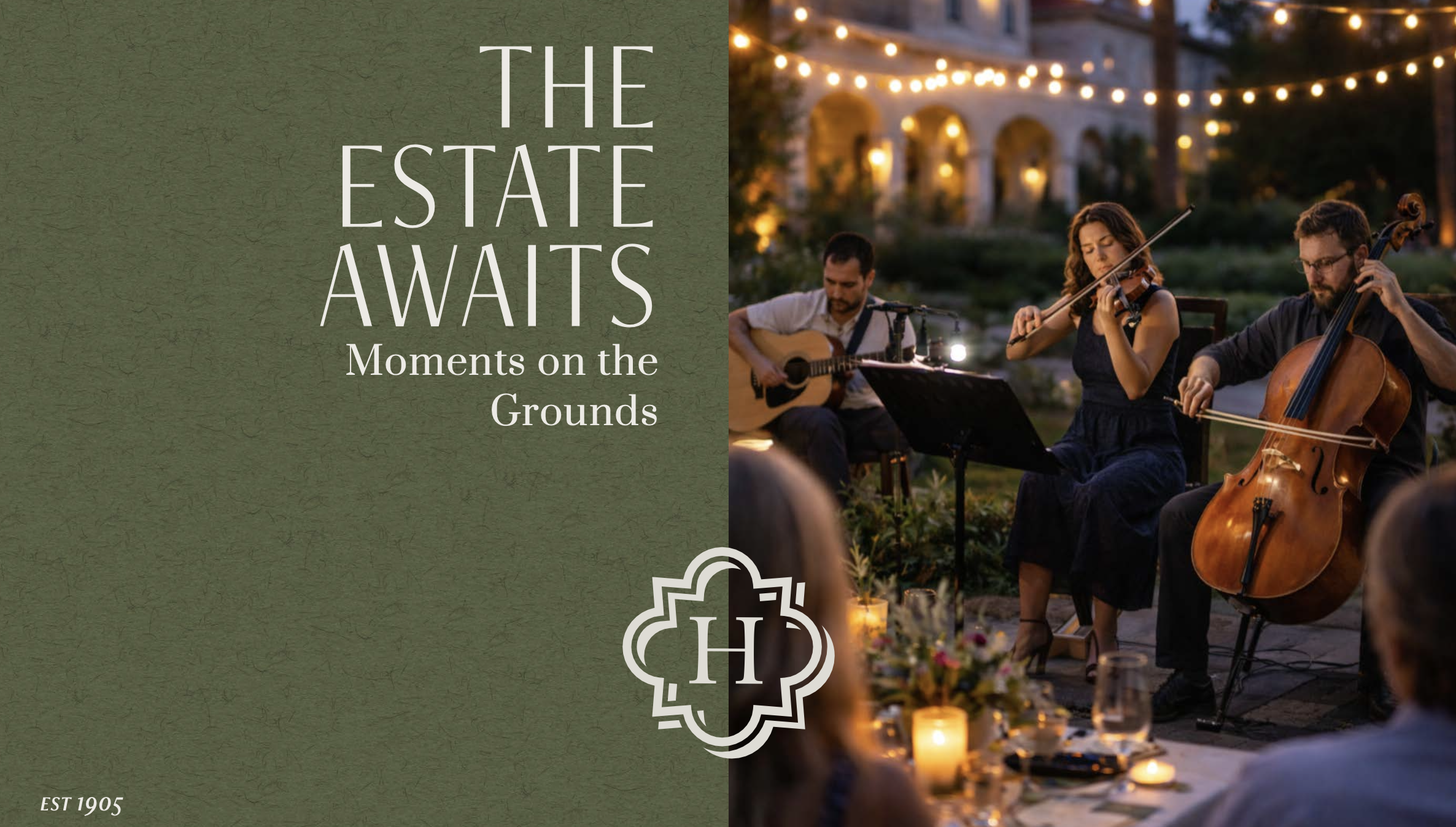
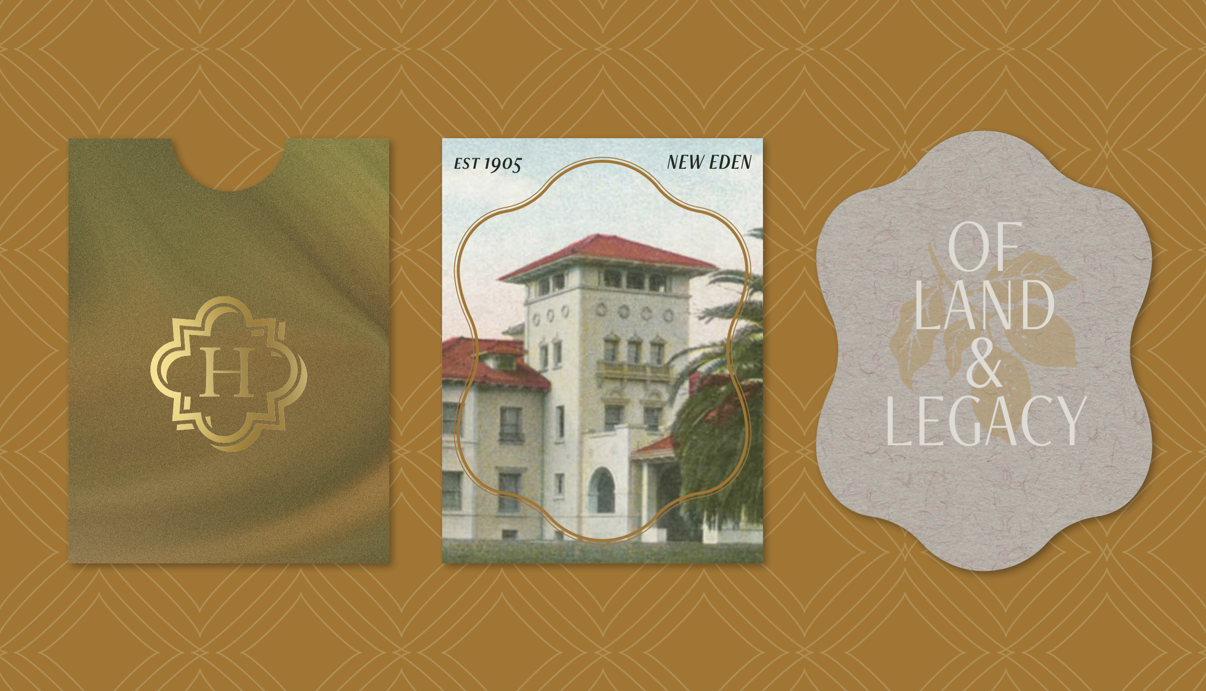
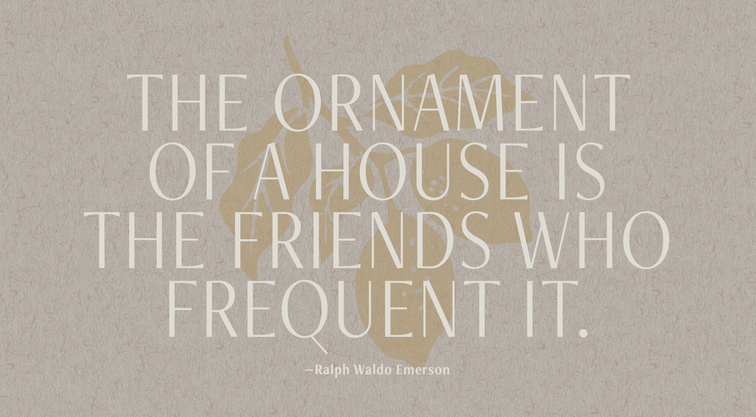
A CALIFORNIA ESTATE OF MIND
Second Wave repositioned Hayes Mansion as a refined estate retreat shaped by land, legacy, and a long tradition of hosting. Anchored in the idea of Life on the Estate, the new positioning emphasizes unhurried pace, thoughtful hospitality, and meaningful gathering rather than amenities or status. The framework balances historic gravitas with modern ease, allowing the property to confidently attract weddings, corporate retreats, buyouts, and leisure guests seeking connection over transaction. Supporting brand pillars and a distinctly measured voice provide clear guidance across marketing, sales, and on-property experience.
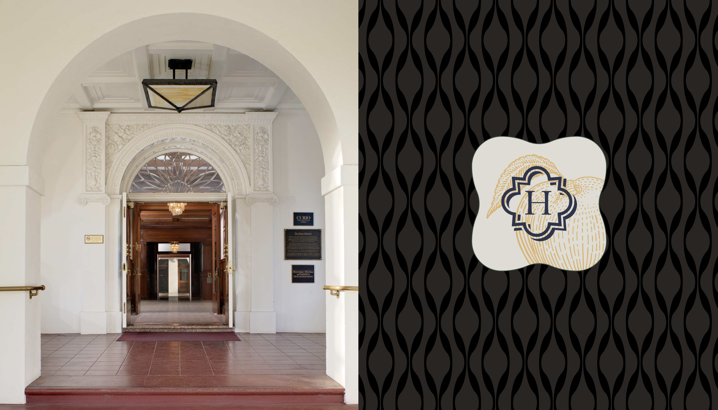
VISUAL LANGUAGE
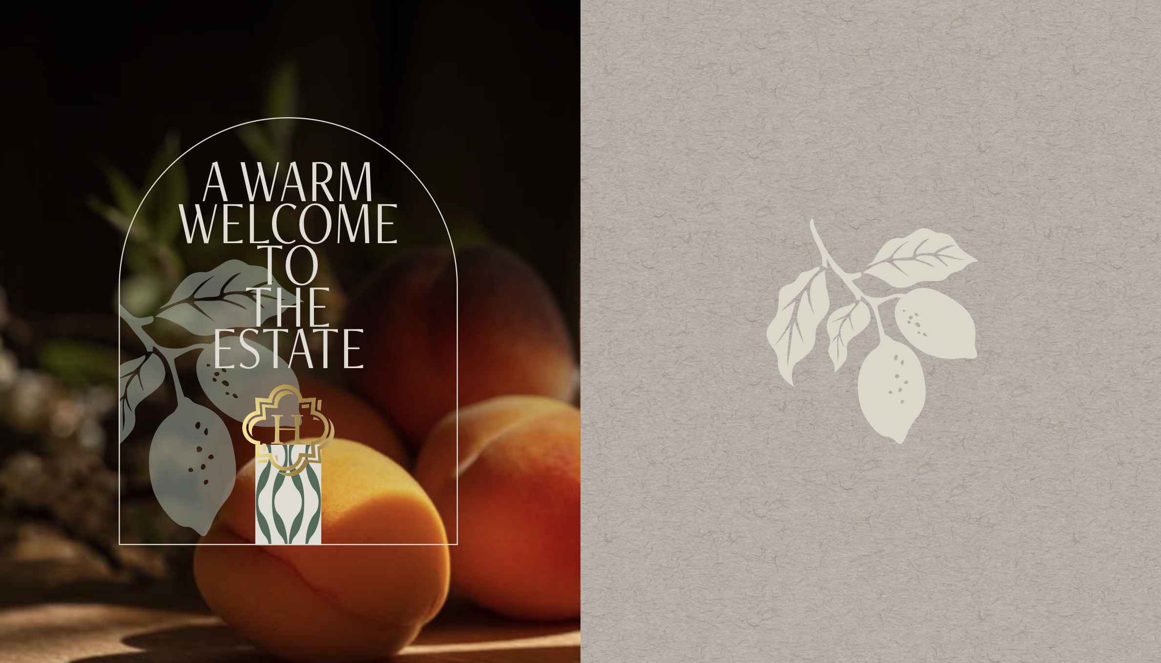
ROOTED IN PLACE
The visual system draws directly from the estate itself…its architecture, orchard roots, materials, and natural rhythms. A restrained, earth-toned palette references stone, fruit, foliage, and patina, while typography balances classical elegance with contemporary clarity. Design choices favor space, proportion, and texture over ornament, creating a visual expression that feels composed, enduring, and lived-in. Across touchpoints, the identity reinforces a sense of calm confidence and an estate meant to be experienced.